Chapter 4
Making Predictions
Correlation
Measuring the relation between two variables
In the last chapter, we began developing a method that would allow us to estimate the birth weight of babies based on the number of gestational days. In this chapter, we develop a more general approach to measuring the relation between two variables and estimating the value of one variable given the value of another.
Our proposed estimate in the example of birth weights was simple:
- Find the ratio of the birth weight to gestational days for each baby in the sample.
- Find the median of the ratios.
- For a new baby, multiply the number of gestational days by that median. This is our estimate of the baby's birth weight.
Here are the data; the column r_bwt_gd contains the ratio of birth weight to gestational days.
baby = Table.read_table('baby.csv')
baby['r_bwt_gd'] = baby['birthwt']/baby['gest_days']
baby
The median of the ratios is just about 0.429 ounces per day:
np.median(baby['r_bwt_gd'])
So we can construct our proposed estimate by multiplying the number of gestational days of each baby by 0.429. The column est_wt contains these estimates.
baby['est_bwt'] = 0.429*baby['gest_days']
baby.drop('r_bwt_gd')
Because of the way they are constructed – by multiplying the gestational days by a constant – The estimates all lie on a straight line.
bb0 = baby.select(['gest_days', 'est_bwt'])
bb0.scatter('gest_days')
plots.ylim(40,200)
plots.xlabel('gestational days')
plots.ylabel('estimated birth weight')

A natural question to ask is, "How good are these estimates?" To get a sense of the answer, let us visualize the data by drawing a scatter plot of birth weight versus gestational days. The scatter plot consists of one point for each of the 1,174 babies in the sample. The horizontal axis represents the number of gestational days and the vertical axis represents the birth weight.
The plot is generated by using a Table method called scatter. The argument is the label of the column that contains the values to be plotted on the horizontal axis. For each of the other columns in the table, a scatter diagram is produced with the corresponding variable on the vertical axis. To generate just one scatter plot, therefore, we start by selecting only the variables that we need.
gd_bwt = baby.select(['gest_days', 'birthwt'])
gd_bwt.scatter('gest_days')
plots.xlabel('gestational days')
plots.ylabel('birth weight')

How good are the estimates that we calculated? To get a sense of this, we will re-draw the scatter plot and overlay the line of estimates. This can be done by using the argument overlay=True when we call scatter.
gd_bwt_est = baby.select(['gest_days', 'birthwt', 'est_bwt'])
gd_bwt_est.scatter('gest_days', overlay=True)
plots.xlabel('gestational days')

The line appears to be roughly in the center of the scatter diagram; if we use the line for estimation, the amount of over-estimation will be comparable to the amount of under-estimation, roughly speaking. This is a natural criterion for determining a "good" straight line of estimates.
Let us see if we can formalize this idea and create a "best" straight line of estimates.
To see roughly where such a line must lie, we will start by attempting to estimate maternal pregnancy weight based on the mother's height. The heights have been measured to the nearest inch, resulting in the vertical stripes in the scatter plot.
ht_pw = baby.select(['mat_ht', 'mat_pw'])
plots.scatter(ht_pw['mat_ht'], ht_pw['mat_pw'], s=5, color='gold')
plots.xlabel('height (inches)')
plots.ylabel('pregnancy weight (pounds)')

Suppose we know that one of the women is 65 inches tall. What would be our estimate for her pregnancy weight?
We know that the point corresponding to this woman must be on the vertical strip at 65 inches. A natural estimate of her pregnancy weight is the average of the weights in that strip; the rough size of the error in this estimate will be the SD of the weights in the strip.
For a woman who is 60 inches tall, our estimate of pregnancy weight would be the average of the weights in the vertical strip at 60 inches. And so on.
Here are the average pregnancy weights for all the values of the heights.
v_means = ht_pw.group('mat_ht', np.mean)
v_means
In the figure below, these averages are overlaid on the scatter plot of pregnancy weight versus height, and appear as green dots at the averages of the vertical strips. The graph of green dots is called the graph of averages. A graph of averages shows the average of the variable on the vertical axis, for each value of the variable on the horizontal axis. It can be used for estimating the variable on the vertical axis, given the variable on the horizontal.
plots.scatter(baby['mat_ht'], baby['mat_pw'], s=5, color='gold')
plots.scatter(v_means['mat_ht'], v_means['mat_pw mean'], color='g')
plots.xlabel('height (inches)')
plots.ylabel('pregnancy weight (pounds)')
plots.title('Graph of Averages')

For these two variables, the graph of averages looks roughly linear: the green dots are fairly close to a straight line for much of the scatter. That straight line is the "best" straight line for estimating pregnancy weight based on height.
To identify the line more precisely, let us examine the oval or football shaped scatter plot.
First, we note that the position of the line is a property of the shape of the scatter, and is not affected by the units in which the heights and weights were measured. Therefore, we will measure both variables in standard units.
Identifying the line that goes through the graph of averages
x_demo = np.random.normal(0, 1, 10000)
z_demo = np.random.normal(0, 1, 10000)
y_demo = 0.5*x_demo + np.sqrt(.75)*z_demo
plots.scatter(x_demo, y_demo, s=10)
plots.xlim(-4, 4)
plots.ylim(-4, 4)
plots.axes().set_aspect('equal')
plots.plot([-4, 4], [-4*0.6,4*0.6], color='g', lw=1)
plots.plot([-4,4],[-4,4], lw=1, color='r')
plots.plot([1.5,1.5], [-4,4], lw=1, color='k')
plots.xlabel('x in standard units')
plots.ylabel('y in standard units')

Here is a football shaped scatter plot. We will follow the usual convention of calling the variable along the horizontal axis $x$ and the variable on the vertical axis $y$. Both variables are in standard units. This implies that the center of the football, corresponding to the point where both variables are at their average, is the origin (0, 0).
Because of the symmetry of the figure, resulting from both variables being measured in standard units, it is natural to see whether the 45 degree line is the best line for estimation. The 45 degree line has been drawn in red. For points on the red line, the value of $x$ in standard units is equal to the value of $y$ in standard units.
Suppose the given value of $x$ is at the average, in other words at 0 on the standard units scale. The points corresponding to that value of $x$ are on the vertical strip at $x$ equal to 0 standard units. The average of the values of $y$ in that strip can be seen to be at 0, by symmetry. So the straight line of estimates should pass through (0, 0).
A careful look at the vertical strips shows that the red line does not work for estimating $y$ based on other values of $x$. For example, suppose the value of $x$ is 1.5 standard units. The black vertical line corresponds to this value of $x$. The points on the scatter whose value of $x$ is 1.5 standard units are the blue dots on the black line; their values on the vertical scale range from about 2 to about 3. It is clear from the figure that the red line does not pass through the average of these points; the red line is too steep.
To get to the average of the vertical strip at $x$ equal to 1.5 standard units, we have to come down from the red line to the center of the strip. The green line is at that point; it has been drawn by connecting the center of the strip to the point (0, 0) and then extending the line on both sides.
The scatter plot is linear, so the green line picks off the centers of the vertical strips. It is the line that should be used to estimate $y$ based on $x$ when both variables are in standard units.
The slope of the red line is equal to 1. The green line is less steep, and so its slope is less than 1. Because it is sloping upwards in the figure, we have established that its slope is between 0 and 1.
Summary. When both variables are measured in standard units, the best line for estimating $y$ based on $x$ is less steep than the 45 degree line and thus has slope less than one. The discussion above was based on a scatter plot sloping upwards, and so the slope of the best line is a number between 0 and 1. For scatter diagrams sloping downwards, the slope would be a number between 0 and -1. For the slope to be close to -1 or 1, the red and green lines must be close, or in other words, the scatter diagram must be tightly clustered around a straight line.
The Correlation Coefficient
This number between -1 and 1 is called the correlation coefficient and is said to measure the correlation between the two variables.
- The correlation coefficient $r$ is a number between $-1$ and 1.
- When both the variables are measured in standard units, $r$ is the slope of the "best straight line" for estimating $y$ based on $x$.
- $r$ measures the extent to which the scatter plot clusters around a straight line of positive or negative slope.
The function football takes a value of $r$ as its argument and generates a football shaped scatter plot with correlation roughly $r$. The red line is the 45 degree line $y=x$, corresponding to points that are the same number of standard units in both variables. The green line, $y = rx$, is a smoothed version of the graph of averages. Points on the green line correspond to our estimates of the variable on the vertical axis, given values on the horizontal.
Call football a few times, with different values of $r$ as the argument, and see how the football changes. Positive $r$ corresponds to positive association: above-average values of one variable are associated with above-average values of the other, and the scatter plot slopes upwards.
Notice also that the bigger the absolute value of $r$, the more clustered the points are around the green line of averages, and the closer the green line is to the red line of equal standard units.
When $r=1$ the scatter plot is perfectly linear and slopes upward. When $r=-1$, the scatter plot is perfectly linear and slopes downward. When $r=0$, the scatter plot is a formless cloud around the horizontal axis, and the variables are said to be uncorrelated.
# Football shaped scatter, both axes in standard units
# Argument of function: correlation coefficient r
# red line: slope = 1 (or -1)
# green line: smoothed graph of averages, slope = r
# Use the green line for estimating y based on x

football(0.6)

football(0.2)

football(0)

football(-0.7)

Calculating $r$
The formula for $r$ is not apparent from our observations so far; it has a mathematical basis that is outside the scope of this class. However, the calculation is straightforward and helps us understand several of the properties of $r$.
Formula for $r$:
- $r$ is the average of the products of the two variables, when both variables are measured in standard units.
Here are the steps in the calculation. We will apply the steps to a simple table of values of $x$ and $y$.
t = Table([np.arange(1,7,1), [2, 3, 1, 5, 2, 7]], ['x','y'])
t
Based on the scatter plot, we expect that $r$ will be positive but not equal to 1.
plots.scatter(t['x'], t['y'], s=30, color='r')
plots.xlim(0, 8)
plots.ylim(0, 8)
plots.xlabel('x')
plots.ylabel('y', rotation=0)

Step 1. Convert each variable to standard units.
t['x_su'] = (t['x'] - np.mean(t['x']))/np.std(t['x'])
t['y_su'] = (t['y'] - np.mean(t['y']))/np.std(t['y'])
t
Step 2. Multiply each pair of standard units.
t['su_product'] = t['x_su']*t['y_su']
t
Step 3. $r$ is the average of the products computed in Step 2.
# r is the average of the products of standard units

r = np.mean(t['su_product'])
r
As expected, $r$ is positive but not equal to 1.
The calculation shows that:
- $r$ is a pure number; it has no units. This is because $r$ is based on standard units.
- $r$ is unaffected by changing the units on either axis. This too is because $r$ is based on standard units.
- $r$ is unaffected by switching the axes. Algebraically, this is because the product of standard units does not depend on which variable is called $x$ and which $y$. Geometrically, switching axes reflects the scatter plot about the line $y=x$, but does not change the amount of clustering nor the sign of the association.
plots.scatter(t['y'], t['x'], s=30, color='r')
plots.xlim(0, 8)
plots.ylim(0, 8)
plots.xlabel('y')
plots.ylabel('x', rotation=0)

The NumPy method corrcoef can be used to calculate $r$. The arguments are an array containing the values of $x$ and another containing the corresponding values of $y$. The program evaluates to a correlation matrix, which is this case is a 2x2 table indexed by $x$ and $y$. The top left element is the correlation between $x$ and $x$, and hence is 1. The top right element is the correlation between $x$ and $y$, which is equal to the correlation between $y$ and $x$ displayed on the bottom left. The bottom right element is 1, the correlation between $y$ and $y$.
np.corrcoef(t['x'], t['y'])
For the purposes of this class, correlation matrices are unnecessary. We will define our own function corr to compute $r$, based on the formula that we used above. The arguments are the name of the table and the labels of the columns containing the two variables. The function returns the mean of the products of standard units, which is $r$.
def corr(table, column_A, column_B):
    x = table[column_A]
    y = table[column_B]
    return np.mean(((x-np.mean(x))/np.std(x))*((y-np.mean(y))/np.std(y)))
Here are examples of calling the function. Notice that it gives the same answer to the correlation between $x$ and $y$ as we got by using np.corrcoef and earlier by direct application of the formula for $r$. Notice also that the correlation between maternal age and birth weight is very low, confirming the lack of any upward or downward trend in the scatter diagram.
corr(t, 'x', 'y')
corr(baby, 'birthwt', 'gest_days')
corr(baby, 'birthwt', 'mat_age')
plots.scatter(baby['mat_age'], baby['birthwt'])
plots.xlabel("mother's age")
plots.ylabel('birth weight')

Properties of Correlation
Correlation is a simple and powerful concept, but it is sometimes misused. Before using $r$, it is important to be aware of the following points.
Correlation only measures association. Correlation does not imply causation. Though the correlation between the weight and the math ability of children in a school district may be positive, that does not mean that doing math makes children heavier or that putting on weight improves the children's math skills. Age is a confounding variable: older children are both heavier and better at math than younger children, on average.
Correlation measures linear association. Variables that have strong non-linear association might have very low correlation. Here is an example of variables that have a perfect quadratic relation $y = x^2$ but have correlation equal to 0.
tsq = Table([np.arange(-4, 4.1, 0.5), np.arange(-4, 4.1, 0.5)**2],
           ['x','y'])
plots.scatter(tsq['x'], tsq['y'])
plots.xlabel('x')
plots.ylabel('y', rotation=0)

corr(tsq, 'x', 'y')
- Outliers can have a big effect on correlation. Here is an example where a scatter plot for which $r$ is equal to 1 is turned into a plot for which $r$ is equal to 0, by the addition of just one outlying point.
t = Table([[1,2,3,4],[1,2,3,4]], ['x','y'])
plots.scatter(t['x'], t['y'], s=30, color='r')
plots.xlim(0, 6)
plots.ylim(-0.5,6)

corr(t, 'x', 'y')
t_outlier = Table([[1,2,3,4,5],[1,2,3,4,0]], ['x','y'])
plots.scatter(t_outlier['x'], t_outlier['y'], s=30, color='r')
plots.xlim(0, 6)
plots.ylim(-0.5,6)

corr(t_outlier, 'x', 'y')
- Correlations based on aggregated data can be misleading. As an example, here are data on the Critical Reading and Math SAT scores in 2014. There is one point for each of the 50 states and one for Washington, D.C. The column
Participation Ratecontains the percent of high school seniors who took the test. The next three columns show the average score in the state on each portion of the test, and the final column is the average of the total scores on the test.
sat2014 = Table.read_table('sat2014.csv').sort('State')
sat2014
The scatter diagram of Math scores versus Critical Reading scores is very tightly clustered around a straight line; the correlation is close to 0.985.
plots.scatter(sat2014['Critical Reading'], sat2014['Math'])
plots.xlabel('Critical Reading')
plots.ylabel('Math')

corr(sat2014, 'Critical Reading', 'Math')
It is important to note that this does not reflect the strength of the relation between the Math and Critical Reading scores of students. States don't take tests – students do. The data in the table have been created by lumping all the students in each state into a single point at the average values of the two variables in that state. But not all students in the state will be at that point, as students vary in their performance. If you plot a point for each student instead of just one for each state, there will be a cloud of points around each point in the figure above. The overall picture will be more fuzzy. The correlation between the Math and Critical Reading scores of the students will be lower than the value calculated based on state averages.
Correlations based on aggregates and averages are called ecological correlations and are frequently reported. As we have just seen, they must be interpreted with care.
Serious or tongue-in-cheek?
In 2012, a paper in the respected New England Journal of Medicine examined the relation between chocolate consumption and Nobel Prizes in a group of countries. The Scientific American responded seriously; others were more relaxed. The paper included the following graph:
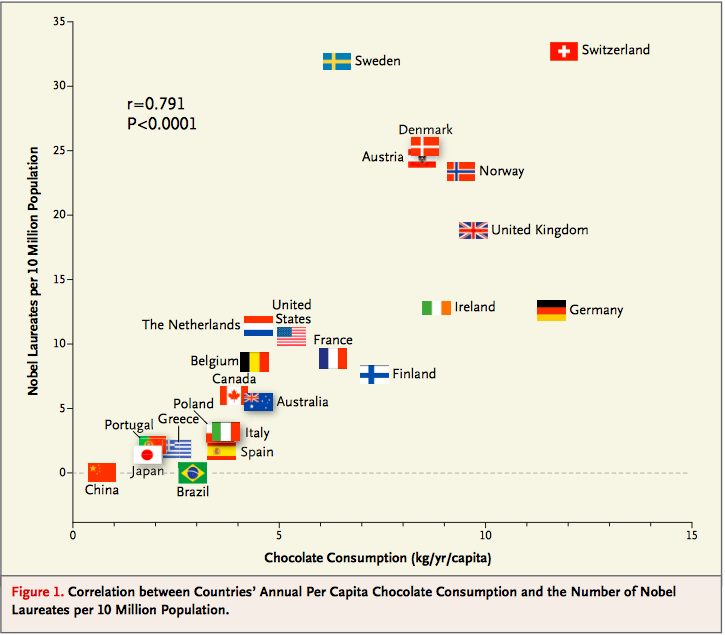
See what you think about the analysis and also about the Reuters report that said, "The p-value Messerli calculated was 0.0001. 'This means that the odds of this being due to chance are less than 1 in 10,000," he said."
Regression
The regression line
The concepts of correlation and the "best" straight line through a scatter plot were developed in the late 1800's and early 1900's. The pioneers in the field were Sir Francis Galton, who was a cousin of Charles Darwin, and Galton's protégé Karl Pearson. Galton was interested in eugenics, and was a meticulous observer of the physical traits of parents and their offspring. Pearson, who had greater expertise than Galton in mathematics, helped turn those observations into the foundations of mathematical statistics.
The scatter plot below is of a famous dataset collected by Pearson and his colleagues in the early 1900's. It consists of the heights, in inches, of 1,078 pairs of fathers and sons.
The data are contained in the table heights, in the columns father and son respectively. In the previous section, we saw how to use the table method scatter to draw scatter plots. Here, the method scatter in the pyplot module of matplotlib (imported as plots) is used for the same purpose. The first argument of scatter is a array containing the variable on the horizontal axis. The second argument contains the variable on the vertical axis. The optional argument s=10 sets the size of the points; the default value is s=20.
# Scatter plot using matplotlib method
heights = Table.read_table('heights.csv')
plots.scatter(heights['father'], heights['son'], s=10)
plots.xlabel("father's height")
plots.ylabel("son's height")

Notice the familiar football shape. This is characteristic of variable pairs that follow a bivariate normal distribution: the scatter plot is oval, the distribution of each variable is roughly normal, and the distribution of the variable in each vertical and horizontal strip is roughly normal as well.
The correlation between the heights of the fathers and sons is about 0.5.
r = corr(heights, 'father', 'son')
r
The regression effect
The figure below shows the scatter plot of the data when both variables are measured in standard units. As we saw earlier, the red line of equal standard units is too steep to serve well as the line of estimates of $y$ based on $x$. Rather, the estimates are on the green line, which is flatter and picks off the centers of the vertical strips.
This flattening was noticed by Galton, who had been hoping that exceptionally tall fathers would have sons who were just as exceptionally tall. However, the data were clear, and Galton realized that the tall fathers have sons who are not quite as exceptionally tall, on average. Frustrated, Galton called this phenomenon "regression to mediocrity." Because of this, the line of best fit through a scatter plot is called the regression line.
Galton also noticed that exceptionally short fathers had sons who were somewhat taller relative to their generation, on average. In general, individuals who are away from average on one variable are expected to be not quite as far away from average on the other. This is called the regression effect.
# The regression effect

f_su = (heights['father']-np.mean(heights['father']))/np.std(heights['father'])
s_su = (heights['son']-np.mean(heights['son']))/np.std(heights['son'])
plots.scatter(f_su, s_su, s=10)
plots.plot([-4, 4], [-4, 4], color='r', lw=1)
plots.plot([-4, 4], [-4*r, 4*r], color='g', lw=1)
plots.axes().set_aspect('equal')

The Table method scatter can be used with the option fit_line=True to draw the regression line through a scatter plot.
# Plotting the regression line, using Table

heights.scatter('father', fit_line=True)
plots.xlabel("father's height")
plots.ylabel("son's height")

Karl Pearson used the observation of the regression effect in the data above, as well as in other data provided by Galton, to develop the formal calculation of the correlation coefficient $r$. That is why $r$ is sometimes called Pearson's correlation.
The equation of the regression line
As we saw in the last section for football shaped scatter plots, when the variables $x$ and $y$ are measured in standard units, the best straight line for estimating $y$ based on $x$ has slope $r$ and passes through the origin. Thus the equation of the regression line can be written as:
$~~~~~~~~~~$ estimate of $y$, in $y$-standard units $~=~$ $r ~ \times$ (the given $x$, in $x$-standard units)
That is, $$ \frac{\mbox{estimate of}~y ~-~\mbox{average of}~y}{\mbox{SD of}~y} ~=~ r \times \frac{\mbox{the given}~x ~-~\mbox{average of}~x}{\mbox{SD of}~x} $$
The equation can be converted into the original units of the data, either by rearranging this equation algebraically, or by labeling some important features of the line both in standard units and in the original units.
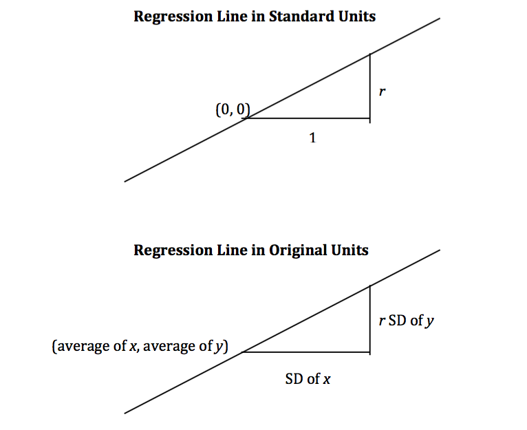
It is a remarkable fact of mathematics that what we have observed to be true for football shaped scatter plots turns out to be true for all scatter plots, no matter what they look like.
Regardless of the shape of the scatter plot:
$$ \mbox{slope of the regression line} ~=~ \frac{r \cdot \mbox{SD of}~y}{\mbox{SD of}~x} ~~~~~~~~~~~~~~~~~~~~~~~~~~~~~~~~~~~ $$$$ \mbox{intercept of the regression line} ~=~ \mbox{average of}~y ~-~ \mbox{slope} \cdot \mbox{(average of}~x\mbox{)} $$Calculation of the slope and intercept
The NumPy method np.polyfit takes as its first argument an array consisiting of the values of the given variable; its second argument an array consisting of the variable to be estimated; its third argument deg=1 specifies that we are fitting a straight line, that is, a polynomial of degree 1. It evaluates to an array consisting of the slope and the intercept of the regression line.
# Slope and intercept by NumPy method

np.polyfit(heights['father'], heights['son'], deg=1)
It is worth noting that the intercept of approximately 33.89 inches is not intended as an estimate of the height of a son whose father is 0 inches tall. There is no such son and no such father. The intercept is merely a geometric or algebraic quantity that helps define the line. In general, it is not a good idea to extrapolate, that is, to make estimates outside the range of the available data. It is certainly not a good idea to extrapolate as far away as 0 is from the heights of the fathers in the study.
The calculations of the slope and intercept of the regression line are straightforward, so we will set np.polyfit aside and write our own function to compute the two quantities. The function regress takes as its arguments the name of the table, the column label of the given variable, and the column label of the variable to be estimated; it evaluates to an array containing the slope and the intercept of the regression line.
# Slope and intercept of regression line

def regress(table, column_x, column_y):
    r = corr(table, column_x, column_y)
    reg_slope = r*np.std(table[column_y])/np.std(table[column_x])
    reg_int = np.mean(table[column_y]) - reg_slope*np.mean(table[column_x])
    return np.array([reg_slope, reg_int])
A call to regress yields the same results as the call to np.polyfit made above.
slope_int_h = regress(heights, 'father', 'son')
slope_int_h
Fitted values
We can use the regression line to get an estimate of the height of every son in the data. The estimated values of $y$ are called the fitted values. They all lie on a straight line. To calculate them, take a son's height, multiply it by the slope of the regression line, and add the intercept. In other words, calculate the height of the regression line at the given value of $x$.
# Estimates of sons' heights are on the regression line

heights['fitted value'] = slope_int_h[0]*heights['father'] + slope_int_h[1]
heights
Residuals
The amount of error in each of these regression estimates is the difference between the son's height and its estimate. These errors are called residuals. Some residuals are positive. These correspond to points that are above the regression line – points for which the regression line under-estimates $y$. Negative residuals correspond to the line over-estimating values of $y$.
# Error in the regression estimate: Distance between observed value and fitted value
# "Residual"

heights['residual'] = heights['son'] - heights['fitted value']
heights
As with deviations from average, the positive and negative residuals exactly cancel each other out. So the average (and sum) of the residuals is 0.
Error in the regression estimate
Though the average residual is 0, each individual residual is not. Some residuals might be quite far from 0. To get a sense of the amount of error in the regression estimate, we will start with a graphical description of the sense in which the regression line is the "best".
Our example is a dataset that has one point for every chapter of the novel "Little Women." The goal is to estimate the number of characters (that is, letters, punctuation marks, and so on) based on the number of periods. Recall that we attempted to do this in the very first lecture of this course.
lw = Table.read_table('little_women.csv')
# One point for each chapter
# Horizontal axis: number of periods
# Vertical axis: number of characters (as in a, b, ", ?, etc; not people in the book)

plots.scatter(lw['Periods'], lw['Characters'])
plots.xlabel('Periods')
plots.ylabel('Characters')

corr(lw, 'Periods', 'Characters')
The scatter plot is remarkably close to linear, and the correlation is more than 0.92.
a = [131, 14431]
b = [231, 20558]
c = [392, 40935]
d = [157, 23524]
def lw_errors(slope, intercept):
    xlims = np.array([50, 450])
    plots.scatter(lw['Periods'], lw['Characters'])
    plots.plot(xlims, slope*xlims + intercept, lw=2)
    plots.plot([a[0],a[0]], [a[1], slope*a[0] + intercept], color='r', lw=2)
    plots.plot([b[0],b[0]], [b[1], slope*b[0] + intercept], color='r', lw=2)
    plots.plot([c[0],c[0]], [c[1], slope*c[0] + intercept], color='r', lw=2)
    plots.plot([d[0],d[0]], [d[1], slope*d[0] + intercept], color='r', lw=2)
    plots.xlabel('Periods')
    plots.ylabel('Characters')
The figure below shows the scatter plot and regression line, with four of the errors marked in red.
# Residuals: Deviations from the regression line

slope_int_lw = regress(lw, 'Periods', 'Characters')
lw_errors(slope_int_lw[0], slope_int_lw[1])

Had we used a different line to create our estimates, the errors would have been different. The picture below shows how big the errors would be if we were to use a particularly silly line for estimation.
# Errors: Deviations from a different line

lw_errors(-100, 50000)

Below is a line that we have used before without saying that we were using a line to create estimates. It is the horizontal line at the value "average of $y$." Suppose you were asked to estimate $y$ and were not told the value of $x$; then you would use the average of $y$ as your estimate, regardless of the chapter. In other words, you would use the flat line below.
Each error that you would make would then be a deviation from average. The rough size of these deviations is the SD of $y$.
In summary, if we use the flat line at the average of $y$ to make our estimates, the estimates will be off by the SD of $y$.
# Errors: Deviations from the flat line at the average of y

lw_errors(0, np.mean(lw['Characters']))

The Method of Least Squares
If you use any arbitrary line as your line of estimates, then some of your errors are likely to be positive and others negative. To avoid cancellation when measuring the rough size of the errors, we take the mean of the sqaured errors rather than the mean of the errors themselves. This is exactly analogous to our reason for looking at squared deviations from average, when we were learning how to calculate the SD.
The mean squared error of estimation using a straight line is a measure of roughly how big the squared errors are; taking the square root yields the root mean square error, which is in the same units as $y$.
Here is the second remarkable fact of mathematics in this section: the regression line minimizes the mean squared error of estimation (and hence also the root mean squared error) among all straight lines. That is why the regression line is sometimes called the "least squares line."
Computing the "best" line.
- To get estimates of $y$ based on $x$, you can use any line you want.
- Every line has a mean squared error of estimation.
- "Better" lines have smaller errors.
- The regression line is the unique straight line that minimizes the mean squared error of estimation among all straight lines.
Regression Functions
Regression is one of the most commonly used methods in statistics, and we will be using it frequently in the next few sections. It will be helpful to be able to call functions to compute the various quantities connected with regression. The first two of the functions below have already been defined; the rest are defined below.
corr: the correlation coefficientregress: the slope and intercept of the regression linefit: the fitted value at one given value of $x$fitted_values: the fitted values at all the values of $x$ in the dataresiduals: the residualsscatter_fit: scatter plot and regression lineresidual_plot: plot of residuals versus $x$
# Correlation coefficient

def corr(table, column_A, column_B):
    x = table[column_A]
    y = table[column_B]
    x_su = (x-np.mean(x))/np.std(x)
    y_su = (y-np.mean(y))/np.std(y)
    return np.mean(x_su*y_su)
# Slope and intercept of regression line

def regress(table, column_x, column_y):
    r = corr(table, column_x, column_y)
    reg_slope = r*np.std(table[column_y])/np.std(table[column_x])
    reg_int = np.mean(table[column_y]) - reg_slope*np.mean(table[column_x])
    return np.array([reg_slope, reg_int])
# Fitted value; the regression estimate at x=new_x

def fit(table, column_x, column_y, new_x):
    slope_int = regress(table, column_x, column_y)
    return slope_int[0]*new_x + slope_int[1]
# Fitted values; the regression estimates lie on a straight line

def fitted_values(table, column_x, column_y):
    slope_int = regress(table, column_x, column_y)
    return slope_int[0]*table[column_x] + slope_int[1]
# Residuals: Deviations from the regression line

def residuals(table, column_x, column_y):
    fitted = fitted_values(table, column_x, column_y)
    return table[column_y] - fitted
# Scatter plot with fitted (regression) line

def scatter_fit(table, column_x, column_y):
    plots.scatter(table[column_x], table[column_y], s=10)
    plots.plot(table[column_x], fitted_values(table, column_x, column_y), lw=1, color='green')
    plots.xlabel(column_x)
    plots.ylabel(column_y)
# A residual plot

def residual_plot(table, column_x, column_y):
    plots.scatter(table[column_x], residuals(table, column_x, column_y), s=10)
    xm = np.min(table[column_x])
    xM = np.max(table[column_x])
    plots.plot([xm, xM], [0, 0], color='k', lw=1)
    plots.xlabel(column_x)
    plots.ylabel('residual')
Residual plots
Suppose you have carried out the regression of sons' heights on fathers' heights.
scatter_fit(heights, 'father', 'son')

It is a good idea to then draw a residual plot. This is a scatter plot of the residuals versus the values of $x$. The residual plot of a good regression looks like the one below: a formless cloud with no pattern, centered around the horizontal axis. It shows that there is no discernible non-linear pattern in the original scatter plot.
residual_plot(heights, 'father','son')

Residual plots can be useful for spotting non-linearity in the data, or other features that weaken the regression analysis. For example, consider the SAT data of the previous section, and suppose you try to estimate the Combined score based on Participation Rate.
sat2014 = Table.read_table('sat2014.csv')
sat2014
plots.scatter(sat2014['Participation Rate'], sat2014['Combined'], s=10)
plots.xlabel('Participation Rate')
plots.ylabel('Combined')

The relation between the variables is clearly non-linear, but you might be tempted to fit a straight line anyway, especially if you did not first draw the scatter diagram of the data.
scatter_fit(sat2014, 'Participation Rate', 'Combined')
plots.title("A bad idea")

The points in the scatter plot start out above the regression line, then are consistently below the line, then above, then below. This pattern of non-linearity is more clearly visible in the residual plot.
residual_plot(sat2014, 'Participation Rate', 'Combined')
plots.title('Residual plot of the bad regression')

This residual plot shows a non-linear pattern, and is a signal that linear regression should not have been used for these data.
The rough size of the residuals
Let us return to the heights of the fathers and sons, and compare the estimates based on using the regression line and the flat line (in yellow) at the average height of the sons. As noted above, the rough size of the errors made using the flat line is the SD of $y$. Clearly, the regression line does a better job of estimating sons' heights than the flat line does; indeed, it minimizes the mean squared error among all lines. Thus, the rough size of the errors made using the regression line must be smaller that that using the flat line. In other words, the SD of the residuals must be smaller than the overall SD of $y$.
ave_y = np.mean(heights['son'])
scatter_fit(heights, 'father', 'son')
plots.plot([np.min(heights['father']), np.max(heights['father'])], [ave_y, ave_y], lw=2, color='gold')

Here, once again, are the residuals in the estimation of sons' heights based on fathers' heights. Each residual is the difference between the height of a son and his estimated (or "fitted") height.
heights
The average of the residuals is 0. All the negative errors exactly cancel out all the positive errors.
The SD of the residuals is about 2.4 inches, while the overall SD of the sons' heights is about 2.7 inches. As expected, the SD of the residuals is smaller than the overall SD of $y$.
np.std(heights['residual'])
np.std(heights['father'])
Smaller by what factor? Another remarkable fact of mathematics is that no matter what the data look like, the SD of the residuals is $\sqrt{1-r^2}$ times the SD of $y$.
np.std(heights['residual'])/np.std(heights['son'])
np.sqrt(1 - r**2)
Average and SD of the Residuals
Regardless of the shape of the scatter plot:
average of the residuals = 0
SD of the residuals $~=~ \sqrt{1 - r^2} \cdot \mbox{SD of}~y$
The residuals are equal to the values of $y$ minus the fitted values. Since the average of the residuals is 0, the average of the fitted values must be equal to the average of $y$.
In the figure below, the fitted values are all on the green line segment. The center of that segment is at the point of averages, consistent with our calculation of the average of the fitted values.
scatter_fit(heights, 'father', 'son')
The SD of the fitted values is visibly smaller than the overall SD of $y$. The fitted values range from about 64 to about 73, whereas the values of $y$ range from about 58 to 77.
So if we take the ratio of the SD of the fitted values to the SD of $y$, we expect to get a number between 0 and 1. And indeed we do: a very special number between 0 and 1.
np.std(heights['fitted value'])/np.std(heights['son'])
r
Here is the final remarkable fact of mathematics in this section:
Average and SD of the Fitted Values
Regardless of the shape of the scatter plot:
average of the fitted values = the average of $y$
SD of the fitted values $~=~ |r| \cdot$ SD of $y$
Notice the absolute value of $r$ in the formula above. For the heights of fathers and sons, the correlation is positive and so there is no difference between using $r$ and using its absolute value. However, the result is true for variables that have negative correlation as well, provided we are careful to use the absolute value of $r$ instead of $r$.
Bootstrap for Regression
Assumptions of randomness: a "regression model"
In the last section, we developed the concepts of correlation and regression as ways to describe data. We will now see how these concepts can become powerful tools for inference, when used appropriately.
Questions of inference may arise if we believe that a scatter plot reflects the underlying relation between the two variables being plotted but does not specify the relation completely. For example, a scatter plot of the heights of fathers and sons shows us the precise relation between the two variables in one particular sample of men; but we might wonder whether that relation holds true, or almost true, among all fathers and sons in the population from which the sample was drawn, or indeed among fathers and sons in general.
As always, inferential thinking begins with a careful examination of the assumptions about the data. Sets of assumptions are known as models. Sets of assumptions about randomness in roughly linear scatter plots are called regression models.
In brief, such models say that the underlying relation between the two variables is perfectly linear; this straight line is the signal that we would like to identify. However, we are not able to see the line clearly. What we see are points that are scattered around the line. In each of the points, the signal has been contaminated by random noise. Our inferential goal, therefore, is to separate the signal from the noise.
In greater detail, the regression model specifies that the points in the scatter plot are generated at random as follows.
- The relation between $x$ and $y$ is perfectly linear. We cannot see this "true line" but Tyche can. She is the Goddess of Chance.
- Tyche creates the scatter plot by taking points on the line and pushing them off the line vertically, either above or below, as follows:
- For each $x$, Tyche finds the corresponding point on the true line, and then adds an error.
- The errors are drawn at random with replacement from a population of errors that has a normal distribution with mean 0.
- Tyche creates a point whose horizontal coordinate is $x$ and whose vertical coordinate is "the height of the true line at $x$, plus the error".
- Finally, Tyche erases the true line from the scatter, and shows us just the scatter plot of her points.
Based on this scatter plot, how should we estimate the true line? The best line that we can put through a scatter plot is the regression line. So the regression line is a natural estimate of the true line.
The simulation below shows how close the regression line is to the true line. The first panel shows how Tyche generates the scatter plot from the true line; the second show the scatter plot that we see; the third shows the regression line through the plot; and the fourth shows both the regression line and the true line.
Run the simulation a few times, with different values for the slope and intercept of the true line, and varying sample sizes. You will see that the regression line is a good estimate of the true line if the sample size is moderately large.
def draw_and_compare(true_slope, true_int, sample_size):
    x = np.random.normal(50, 5, sample_size)
    xlims = np.array([np.min(x), np.max(x)])
    eps = np.random.normal(0, 6, sample_size)
    y = (true_slope*x + true_int) + eps
    tyche = Table([x,y],['x','y'])

    plots.figure(figsize=(6, 16))
    plots.subplot(4, 1, 1)
    plots.scatter(tyche['x'], tyche['y'], s=10)
    plots.plot(xlims, true_slope*xlims + true_int, lw=1, color='gold')
    plots.title('What Tyche draws')

    plots.subplot(4, 1, 2)
    plots.scatter(tyche['x'],tyche['y'], s=10)
    plots.title('What we get to see')

    plots.subplot(4, 1, 3)
    scatter_fit(tyche, 'x', 'y')
    plots.xlabel("")
    plots.ylabel("")
    plots.title('Regression line: our estimate of true line')

    plots.subplot(4, 1, 4)
    scatter_fit(tyche, 'x', 'y')
    xlims = np.array([np.min(tyche['x']), np.max(tyche['x'])])
    plots.plot(xlims, true_slope*xlims + true_int, lw=1, color='gold')
    plots.title("Regression line and true line")
# Tyche's true line,
# the points she creates,
# and our estimate of the true line.
# Arguments: true slope, true intercept, number of points

draw_and_compare(3, -5, 20)

In reality, of course, we are not Tyche, and we will never see the true line. What the simulation shows that if the regression model looks plausible, and we have a large sample, then regression line is a good approximation to the true line.
Here is an example where regression model can be used to make predictions.
The data are a subset of the information gathered in a randomized controlled trial about treatments for Hodgkin's disease. Hodgkin's disease is a cancer that typically affects young people. The disease is curable but the treatment is very harsh. The purpose of the trial was to come up with dosage that would cure the cancer but minimize the adverse effects on the patients.
This table hodgkins contains data on the effect that the treatment had on the lungs of 22 patients. The columns are:
- Height in cm
- A measure of radiation to the mantle (neck, chest, under arms)
- A measure of chemotherapy
- A score of the health of the lungs at baseline, that is, at the start of the treatment; higher scores correspond to more healthy lungs
- The same score of the health of the lungs, 15 months after treatment
hodgkins = Table.read_table('hodgkins.csv')
hodgkins.show()
It is evident that the patients' lungs were less healthy 15 months after the treatment than at baseline. At 36 months, they did recover most of their lung function, but those data are not part of this table.
The scatter plot below shows that taller patients had higher scores at 15 months.
scatter_fit(hodgkins, 'height', 'month15')

Prediction
The scatter plot looks roughly linear. Let us assume that the regression model holds. Under that assumption, the regression line can be used to predict the 15-month score of a new patient, based on the patient's height. The prediction will be good provided the assumptions of the regression model are justified for these data, and provided the new patient is similar to those in the study.
The function regress gives us the slope and intercept of the regression line. To predict the 15-month score of a new patient whose height is $x$ cm, we use the following calculation:
Predicted 15-month score of a patient who is $x$ inches tall $~=~$ slope$\;\times\;x ~+~$ intercept
The predicted 15-month score of a patient who is 173 cm tall is 83.66 cm, and that of a patient who is 163 cm tall is 73.69 cm.
# slope and intercept
slope_int = regress(hodgkins, 'height', 'month15')
slope_int
# New patient, 173 cm tall
# Predicted 15-month score:

slope_int[0]*173 + slope_int[1]
# New patient, 163 cm tall
# Predicted 15-month score:

slope_int[0]*163 + slope_int[1]
The Variability of the Prediction
As data scientists working under the regression model, we know that the sample might have been different. Had the sample been different, the regression line would have been different too, and so would our prediction. To see how good our prediction is, we must get a sense of how variable the prediction can be.
One way to do this would be by generating new random samples of points and making a prediction based on each new sample. To generate new samples, we can bootstrap the scatter plot.
Specifically, we can simulate new samples by random sampling with replacement from the original scatter plot, as many times as there are points in the scatter.
Here is the original scatter diagram from the sample, and four replications of the bootstrap resampling procedure. Notice how the resampled scatter plots are in general a little more sparse than the original. That is because some of the original point do not get selected in the samples.
plots.figure(figsize=(6, 16))
plots.subplot(5, 1, 1)
plots.scatter(hodgkins['height'], hodgkins['month15'])
plots.title('Original sample')

plots.subplot(5,1,2)
rep = hodgkins.sample(with_replacement=True)
plots.scatter(rep['height'], rep['month15'])
plots.title('Bootstrap sample 1')

plots.subplot(5, 1, 3)
rep = hodgkins.sample(with_replacement=True)
plots.scatter(rep['height'], rep['month15'])
plots.title('Bootstrap sample 2')

plots.subplot(5, 1, 4)
rep = hodgkins.sample(with_replacement=True)
plots.scatter(rep['height'], rep['month15'])
plots.title('Bootstrap sample 3')

plots.subplot(5, 1, 5)
rep = hodgkins.sample(with_replacement=True)
plots.scatter(rep['height'], rep['month15'])
plots.title('Bootstrap sample 4')

The next step is to fit the regression line to the scatter plot in each replication, and make a prediction based on each line. The figure below shows 10 such lines, and the corresponding predicted 15-month scores for a patient whose height is 173 cm.
x = 173

h = hodgkins['height']
m15 = hodgkins['month15']
xlims = np.array([np.min(h), np.max(h)])

results = Table([[],[]], ['slope','intercept'])
for i in range(10):
    rep = hodgkins.sample(with_replacement=True)
    results.append(Table.from_rows([regress(rep, 'height','month15')], ['slope','intercept']))
results['prediction at x='+str(x)] = results['slope']*x + results['intercept']

left = xlims[0]*results['slope'] + results['intercept']
right = xlims[1]*results['slope'] + results['intercept']
fit_x = x*results['slope'] + results['intercept']

for i in range(10):
    plots.plot(xlims, np.array([left[i], right[i]]), lw=1)
    plots.scatter(x, fit_x[i])

The table below shows the slope and intercept of each of the 10 lines, along with the prediction.
results
Bootstrap prediction interval
If we increase the number of repetitions of the resampling process, we can generate an empirical histogram of the predictions. This will allow us to create a prediction interval, by the same methods that we used earlier to create bootstrap confidence intervals for numerical parameters.
# Bootstrap prediction at new_x
# Hodgkin's disease table, x = height, y = month15

def bootstrap_ht_m15(new_x, repetitions):

    # For each repetition:
    # Bootstrap the scatter;
    # get the regression prediction at new_x;
    # augment the predictions list
    pred = []
    for i in range(repetitions):
        bootstrap_sample = hodgkins.sample(with_replacement=True)
        p = fit(bootstrap_sample, 'height', 'month15', new_x)
        pred.append(p)

    # Prediction based on original sample
    obs = fit(hodgkins, 'height', 'month15', new_x)

    # Display results
    pred = Table([pred], ['pred'])
    pred.hist(bins=np.arange(55,100,2), normed=True)
    plots.ylim(0, 0.1)
    plots.xlabel('predictions at x='+str(new_x))
    print('Height of regression line at x='+str(new_x)+':', obs)
    print('Approximate 95%-confidence interval:')
    print((pred.percentile(2.5).rows[0][0], pred.percentile(97.5).rows[0][0]))
bootstrap_ht_m15(173, 5000)

The figure above shows a bootstrap empirical histogram of the predicted 15-month score of a patient who is 173 cm tall. The empirical distribution is roughly normal. An approximate 95% prediction interval of scores ranges from about 74.7 to about 91.4. The prediction based on the original sample was about 83.6, which is close to the center of the interval.
The figure below shows the corresponding figure for a patient whose height is 163 cm. Notice that while this empirical histogram too is roughly bell shaped, the approximation is not as good as the one above for a given height of 173 cm. Also, the distribution is more spread out than the one above. That is because 163 cm is near the low end of the heights of the sampled patients, and there is not much data around a height of 163 cm. By contrast, several patients were 173 cm tall. Therefore we can make better predictions for patients who are 173 cm tall than for patients whose height is 163 cm.
bootstrap_ht_m15(163, 5000)

The function bootstrap_pred returns an approximate 95% prediction interval and a bootstrap empirical distribution of the prediction. Its arguments are:
- the name of the table containing the data
- the label of the column containing the known variable, $x$
- the label of the column containing the variable to be predicted, $y$
- the value of $x$ at which to make the prediction
- the number of repetitions of the bootstrap resampling procedure
In every repetition, the function draws a bootstrap sample and finds the fitted value at the specified value of $x$. Below, the function has been called to make a prediction at a height of 180 cm.
def bootstrap_pred(table, column_x, column_y, new_x, repetitions):

    # For each repetition:
    # Bootstrap the scatter;
    # get the regression prediction at new_x
    # augment the predictions list
    pred = []
    for i in range(repetitions):
        bootstrap_sample = table.sample(with_replacement=True)
        p = fit(bootstrap_sample, column_x, column_y, new_x)
        pred.append(p)

    # Prediction based on regression line through original sample
    obs = fit(table, column_x, column_y, new_x)

    # Display results
    pred = Table([pred], ['pred'])
    pred.hist(bins=20, normed=True)
    plots.xlabel('predictions at x='+str(new_x))
    print('Height of regression line at x='+str(new_x)+':', obs)
    print('Approximate 95%-confidence interval:')
    print((pred.percentile(2.5).rows[0][0], pred.percentile(97.5).rows[0][0]))
bootstrap_pred(hodgkins, 'height', 'month15', 180, 5000)

Is there a linear trend at all?
The bootstrap method can also be used to see whether there is any correlation between two variables.
From the scatter plot below, it appears that there is little or no correlation between the amont of radiation patients received and their 15-month score
scatter_fit(hodgkins, 'rad', 'month15')

To see whether this lack of linear relation is true, we can create a bootstrap confidence interval for the slope of the true line, analogously to the confidence intervals we constructed in earlier sections using the bootstrap percentile method.
The figure below shows the empirical distribution of the slopes and an approximate 95% confidence interval for the true slope. The interval runs from about -0.05 to 0.05, and contains the slope of 0. There is no strong reason to doubt that the slope of the true line is around 0.
def bootstrap_slope(table, column_x, column_y, repetitions):

    # For each repetition:
    # Bootstrap the scatter, get the slope of the regression line,
    # augment the results list
    slopes = []
    for i in range(repetitions):
        bootstrap_sample = table.sample(with_replacement=True)
        slopes.append(regress(bootstrap_sample, column_x, column_y)[0])

    # Slope of the regression line from the original sample
    obs = regress(table, column_x, column_y)[0]

    # Display results
    slopes = Table([slopes],['slopes'])
    slopes.hist(bins=20, normed=True)
    plots.xlabel('slopes')
    print('Slope of regression line:', obs)
    print('Approximate 95%-confidence interval:')
    print((slopes.percentile(2.5).rows[0][0], slopes.percentile(97.5).rows[0][0]))
bootstrap_slope(hodgkins, 'rad', 'month15', 5000)

Classification
This section will discuss machine learning. Machine learning is a class of techniques for automatically finding patterns in data and using it to draw inferences or make predictions. We're going to focus on a particular kind of machine learning, namely, classification.
Classification is about learning how to make predictions from past examples: we're given some examples where we have been told what the correct prediction was, and we want to learn from those examples how to make good predictions in the future. Here are a few applications where classification is used in practice:
For each order Amazon receives, Amazon would like to predict: is this order fraudulent? They have some information about each order (e.g., its total value, whether the order is being shipped to an address this customer has used before, whether the shipping address is the same as the credit card holder's billing address). They have lots of data on past orders, and they know whether which of those past orders were fraudulent and which weren't. They want to learn patterns that will help them predict, as new orders arrive, whether those new orders are fraudulent.
Online dating sites would like to predict: are these two people compatible? Will they hit it off? They have lots of data on which matches they've suggested to their customers in the past, and they have some idea which ones were successful. As new customers sign up, they'd like to predict make predictions about who might be a good match for them.
Doctors would like to know: does this patient have cancer? Based on the measurements from some lab test, they'd like to be able to predict whether the particular patient has cancer. They have lots of data on past patients, including their lab measurements and whether they ultimately developed cancer, and from that, they'd like to try to infer what measurements tend to be characteristic of cancer (or non-cancer) so they can diagnose future patients accurately.
Politicians would like to predict: are you going to vote for them? This will help them focus fundraising efforts on people who are likely to support them, and focus get-out-the-vote efforts on voters who will vote for them. Public databases and commercial databases have a lot of information about most people: e.g., whether they own a home or rent; whether they live in a rich neighborhood or poor neighborhood; their interests and hobbies; their shopping habits; and so on. And political campaigns have surveyed some voters and found out who they plan to vote for, so they have some examples where the correct answer is known. From this data, the campaigns would like to find patterns that will help them make predictions about all other potential voters.
All of these are classification tasks. Notice that in each of these examples, the prediction is a yes/no question -- we call this binary classification, because there are only two possible predictions. In a classification task, we have a bunch of observations. Each observation represents a single individual or a single situation where we'd like to make a prediction. Each observation has multiple attributes, which are known (e.g., the total value of the order; voter's annual salary; and so on). Also, each observation has a class, which is the answer to the question we care about (e.g., yes or no; fraudulent or not; etc.).
For instance, with the Amazon example, each order corresponds to a single observation. Each observation has several attributes (e.g., the total value of the order, whether the order is being shipped to an address this customer has used before, and so on). The class of the observation is either 0 or 1, where 0 means that the order is not fraudulent and 1 means that the order is fraudulent. Given the attributes of some new order, we are trying to predict its class.
Classification requires data. It involves looking for patterns, and to find patterns, you need data. That's where the data science comes in. In particular, we're going to assume that we have access to training data: a bunch of observations, where we know the class of each observation. The collection of these pre-classified observations is also called a training set. A classification algorithm is going to analyze the training set, and then come up with a classifier: an algorithm for predicting the class of future observations.
Note that classifiers do not need to be perfect to be useful. They can be useful even if their accuracy is less than 100%. For instance, if the online dating site occasionally makes a bad recommendation, that's OK; their customers already expect to have to meet many people before they'll find someone they hit it off with. Of course, you don't want the classifier to make too many errors -- but it doesn't have to get the right answer every single time.
Chronic kidney disease
Let's work through an example. We're going to work with a data set that was collected to help doctors diagnose chronic kidney disease (CKD). Each row in the data set represents a single patient who was treated in the past and whose diagnosis is known. For each patient, we have a bunch of measurements from a blood test. We'd like to find which measurements are most useful for diagnosing CKD, and develop a way to classify future patients as "has CKD" or "doesn't have CKD" based on their blood test results.
Let's load the data set into a table and look at it.
ckd = Table.read_table('ckd.csv')
ckd
We have data on 158 patients. There are an awful lot of attributes here. The column labelled "Class" indicates whether the patient was diagnosed with CKD: 1 means they have CKD, 0 means they do not have CKD.
Let's look at two columns in particular: the hemoglobin level (in the patient's blood), and the blood glucose level (at a random time in the day; without fasting specially for the blood test). We'll draw a scatter plot, to make it easy to visualize this. Red dots are patients with CKD; blue dots are patients without CKD. What test results seem to indicate CKD?
plots.figure(figsize=(8,8))
plots.scatter(ckd['Hemoglobin'], ckd['Blood Glucose Random'], c=ckd['Class'], s=30)
plots.xlabel('Hemoglobin')
plots.ylabel('Glucose')

Suppose Alice is a new patient who is not in the data set. If I tell you Alice's hemoglobin level and blood glucose level, could you predict whether she has CKD? It sure looks like it! You can see a very clear pattern here: points in the lower-right tend to represent people who don't have CKD, and the rest tend to be folks with CKD. To a human, the pattern is obvious. But how can we program a computer to automatically detect patterns such as this one?
Well, there are lots of kinds of patterns one might look for, and lots of algorithms for classification. But I'm going to tell you about one that turns out to be surprisingly effective. It is called nearest neighbor classification. Here's the idea. If we have Alice's hemoglobin and glucose numbers, we can put her somewhere on this scatterplot; the hemoglobin is her x-coordinate, and the glucose is her y-coordinate. Now, to predict whether she has CKD or not, we find the nearest point in the scatterplot and check whether it is red or blue; we predict that Alice should receive the same diagnosis as that patient.
In other words, to classify Alice as CKD or not, we find the patient in the training set who is "nearest" to Alice, and then use that patient's diagnosis as our prediction for Alice. The intuition is that if two points are near each other in the scatterplot, then the corresponding measurements are pretty similar, so we might expect them to receive the same diagnosis (more likely than not). We don't know Alice's diagnosis, but we do know the diagnosis of all the patients in the training set, so we find the patient in the training set who is most similar to Alice, and use that patient's diagnosis to predict Alice's diagnosis.
The scatterplot suggests that this nearest neighbor classifier should be pretty accurate. Points in the lower-right will tend to receive a "no CKD" diagnosis, as their nearest neighbor will be a blue point. The rest of the points will tend to receive a "CKD" diagnosis, as their nearest neighbor will be a red point. So the nearest neighbor strategy seems to capture our intuition pretty well, for this example.
However, the separation between the two classes won't always be quite so clean. For instance, suppose that instead of hemoglobin levels we were to look at white blood cell count. Look at what happens:
plots.figure(figsize=(8,8))
plots.scatter(ckd['White Blood Cell Count'], ckd['Blood Glucose Random'], c=ckd['Class'], s=30)
plots.xlabel('White Blood Cell Count')
plots.ylabel('Glucose')

As you can see, non-CKD individuals are all clustered in the lower-left. Most of the patients with CKD are above or to the right of that cluster... but not all. There are some patients with CKD who are in the lower left of the above figure (as indicated by the handful of red dots scattered among the blue cluster). What this means is that you can't tell for certain whether someone has CKD from just these two blood test measurements.
If we are given Alice's glucose level and white blood cell count, can we predict whether she has CKD? Yes, we can make a prediction, but we shouldn't expect it to be 100% accurate. Intuitively, it seems like there's a natural strategy for predicting: plot where Alice lands in the scatter plot; if she is in the lower-left, predict that she doesn't have CKD, otherwise predict she has CKD. This isn't perfect -- our predictions will sometimes be wrong. (Take a minute and think it through: for which patients will it make a mistake?) As the scatterplot above indicates, sometimes people with CKD have glucose and white blood cell levels that look identical to those of someone without CKD, so any classifier is inevitably going to make the wrong prediction for them.
Can we automate this on a computer? Well, the nearest neighbor classifier would be a reasonable choice here too. Take a minute and think it through: how will its predictions compare to those from the intuitive strategy above? When will they differ? Its predictions will be pretty similar to our intuitive strategy, but occasionally it will make a different prediction. In particular, if Alice's blood test results happen to put her right near one of the red dots in the lower-left, the intuitive strategy would predict "not CKD", whereas the nearest neighbor classifier will predict "CKD".
There is a simple generalization of the nearest neighbor classifier that fixes this anomaly. It is called the k-nearest neighbor classifier. To predict Alice's diagnosis, rather than looking at just the one neighbor closest to her, we can look at the 3 points that are closest to her, and use the diagnosis for each of those 3 points to predict Alice's diagnosis. In particular, we'll use the majority value among those 3 diagnoses as our prediction for Alice's diagnosis. Of course, there's nothing special about the number 3: we could use 4, or 5, or more. (It's often convenient to pick an odd number, so that we don't have to deal with ties.) In general, we pick a number $k$, and our predicted diagnosis for Alice is based on the $k$ patients in the training set who are closest to Alice. Intuitively, these are the $k$ patients whose blood test results were most similar to Alice, so it seems reasonable to use their diagnoses to predict Alice's diagnosis.
The $k$-nearest neighbor classifier will now behave just like our intuitive strategy above.
Decision boundary
Sometimes a helpful way to visualize a classifier is to map the region of space where the classifier would predict 'CKD', and the region of space where it would predict 'not CKD'. We end up with some boundary between the two, where points on one side of the boundary will be classified 'CKD' and points on the other side will be classified 'not CKD'. This boundary is called the decision boundary. Each different classifier will have a different decision boundary; the decision boundary is just a way to visualize what criteria the classifier is using to classify points.
Banknote authentication
Let's do another example. This time we'll look at predicting whether a banknote (e.g., a \$20 bill) is counterfeit or legitimate. Researchers have put together a data set for us, based on photographs of many individual banknotes: some counterfeit, some legitimate. They computed a few numbers from each image, using techniques that we won't worry about for this course. So, for each banknote, we know a few numbers that were computed from a photograph of it as well as its class (whether it is counterfeit or not). Let's load it into a table and take a look.
banknotes = Table.read_table('banknote.csv')
banknotes
Let's look at whether the first two numbers tell us anything about whether the banknote is counterfeit or not. Here's a scatterplot:
plots.figure(figsize=(8,8))
plots.scatter(banknotes['WaveletVar'], banknotes['WaveletCurt'], c=banknotes['Class'])

Pretty interesting! Those two measurements do seem helpful for predicting whether the banknote is counterfeit or not. However, in this example you can now see that there is some overlap between the blue cluster and the red cluster. This indicates that there will be some images where it's hard to tell whether the banknote is legitimate based on just these two numbers. Still, you could use a $k$-nearest neighbor classifier to predict the legitimacy of a banknote.
Take a minute and think it through: Suppose we used $k=11$ (say). What parts of the plot would the classifier get right, and what parts would it make errors on? What would the decision boundary look like?
The patterns that show up in the data can get pretty wild. For instance, here's what we'd get if used a different pair of measurements from the images:
plots.figure(figsize=(8,8))
plots.scatter(banknotes['WaveletSkew'], banknotes['Entropy'], c=banknotes['Class'])

There does seem to be a pattern, but it's a pretty complex one. Nonetheless, the $k$-nearest neighbors classifier can still be used and will effectively "discover" patterns out of this. This illustrates how powerful machine learning can be: it can effectively take advantage of even patterns that we would not have anticipated, or that we would have thought to "program into" the computer.
Multiple attributes
So far I've been assuming that we have exactly 2 attributes that we can use to help us make our prediction. What if we have more than 2? For instance, what if we have 3 attributes?
Here's the cool part: you can use the same ideas for this case, too. All you have to do is make a 3-dimensional scatterplot, instead of a 2-dimensional plot. You can still use the $k$-nearest neighbors classifier, but now computing distances in 3 dimensions instead of just 2. It just works. Very cool!
In fact, there's nothing special about 2 or 3. If you have 4 attributes, you can use the $k$-nearest neighbors classifier in 4 dimensions. 5 attributes? Work in 5-dimensional space. And no need to stop there! This all works for arbitrarily many attributes; you just work in a very high dimensional space. It gets wicked-impossible to visualize, but that's OK. The computer algorithm generalizes very nicely: all you need is the ability to compute the distance, and that's not hard. Mind-blowing stuff!
For instance, let's see what happens if we try to predict whether a banknote is counterfeit or not using 3 of the measurements, instead of just 2. Here's what you get:
ax = plots.figure(figsize=(8,8)).add_subplot(111, projection='3d')
ax.scatter(banknotes['WaveletSkew'], banknotes['WaveletVar'], banknotes['WaveletCurt'], c=banknotes['Class'])

Awesome! With just 2 attributes, there was some overlap between the two clusters (which means that the classifier was bound to make some mistakes for pointers in the overlap). But when we use these 3 attributes, the two clusters have almost no overlap. In other words, a classifier that uses these 3 attributes will be more accurate than one that only uses the 2 attributes.
This is a general phenomenom in classification. Each attribute can potentially give you new information, so more attributes sometimes helps you build a better classifier. Of course, the cost is that now we have to gather more information to measure the value of each attribute, but this cost may be well worth it if it significantly improves the accuracy of our classifier.
To sum up: you now know how to use $k$-nearest neighbor classification to predict the answer to a yes/no question, based on the values of some attributes, assuming you have a training set with examples where the correct prediction is known. The general roadmap is this:
- identify some attributes that you think might help you predict the answer to the question;
- gather a training set of examples where you know the values of the attributes as well as the correct prediction;
- to make predictions in the future, measure the value of the attributes and then use $k$-nearest neighbor classification to predict the answer to the question.
Breast cancer diagnosis
Now I want to do a more extended example based on diagnosing breast cancer. I was inspired by Brittany Wenger, who won the Google national science fair three years ago as a 17-year old high school student. Here's Brittany:
Brittany's science fair project was to build a classification algorithm to diagnose breast cancer. She won grand prize for building an algorithm whose accuracy was almost 99%.
Let's see how well we can do, with the ideas we've learned in this course.
So, let me tell you a little bit about the data set. Basically, if a woman has a lump in her breast, the doctors may want to take a biopsy to see if it is cancerous. There are several different procedures for doing that. Brittany focused on fine needle aspiration (FNA), because it is less invasive than the alternatives. The doctor gets a sample of the mass, puts it under a microscope, takes a picture, and a trained lab tech analyzes the picture to determine whether it is cancer or not. We get a picture like one of the following:


Unfortunately, distinguishing between benign vs malignant can be tricky. So, researchers have studied using machine learning to help with this task. The idea is that we'll ask the lab tech to analyze the image and compute various attributes: things like the typical size of a cell, how much variation there is among the cell sizes, and so on. Then, we'll try to use this information to predict (classify) whether the sample is malignant or not. We have a training set of past samples from women where the correct diagnosis is known, and we'll hope that our machine learning algorithm can use those to learn how to predict the diagnosis for future samples.
We end up with the following data set. For the "Class" column, 1 means malignant (cancer); 0 means benign (not cancer).
patients = Table.read_table('breast-cancer.csv')
patients = patients.drop('ID')
patients
So we have 9 different attributes. I don't know how to make a 9-dimensional scatterplot of all of them, so I'm going to pick two and plot them:
plots.figure(figsize=(8,8))
plots.scatter(patients['Bland Chromatin'], patients['Single Epithelial Cell Size'], c=patients['Class'], s=30)
plots.xlabel('Bland Chromatin')
plots.ylabel('Single Epithelial Cell Size')

Oops. That plot is utterly misleading, because there are a bunch of points that have identical values for both the x- and y-coordinates. To make it easier to see all the data points, I'm going to add a little bit of random jitter to the x- and y-values. Here's how that looks:
def randomize_column(a):
    return a + np.random.normal(0.0, 0.09, size=len(a))
plots.figure(figsize=(8,8))
plots.scatter(randomize_column(patients['Bland Chromatin']), randomize_column(patients['Single Epithelial Cell Size']), c=patients['Class'], s=30)
plots.xlabel('Bland Chromatin (jittered)')
plots.ylabel('Single Epithelial Cell Size (jittered)')

For instance, you can see there are lots of samples with chromatin = 2 and epithelial cell size = 2; all non-cancerous.
Keep in mind that the jittering is just for visualization purposes, to make it easier to get a feeling for the data. When we want to work with the data, we'll use the original (unjittered) data.
Applying the k-nearest neighbor classifier to breast cancer diagnosis
We've got a data set. Let's try out the $k$-nearest neighbor classifier and see how it does. This is going to be great.
We're going to need an implementation of the $k$-nearest neighbor classifier. In practice you would probably use an existing library, but it's simple enough that I'm going to imeplment it myself.
The first thing we need is a way to compute the distance between two points. How do we do this? In 2-dimensional space, it's pretty easy. If we have a point at coordinates $(x_0,y_0)$ and another at $(x_1,y_1)$, the distance between them is
$$D = \sqrt{(x_0-x_1)^2 + (y_0-y_1)^2}.$$(Where did this come from? It comes from the Pythogorean theorem: we have a right triangle with side lengths $x_0-x_1$ and $y_0-y_1$, and we want to find the length of the diagonal.)
In 3-dimensional space, the formula is
$$D = \sqrt{x_0-x_1)^2 + (y_0-y_1)^2 + (z_0-z_1)^2}.$$In $k$-dimensional space, things are a bit harder to visualize, but I think you can see how the formula generalized: we sum up the squares of the differences between each individual coordinate, and then take the square root of that. Let's implement a function to compute this distance function for us:
def distance(pt1, pt2):
    tot = 0
    for i in range(len(pt1)):
        tot = tot + (pt1[i] - pt2[i])**2
    return math.sqrt(tot)
Next, we're going to write some code to implement the classifier. The input is a patient p who we want to diagnose. The classifier works by finding the $k$ nearest neighbors of p from the training set. So, our approach will go like this:
Find the closest $k$ neighbors of
p, i.e., the $k$ patients from the training set that are most similar top.Look at the diagnoses of those $k$ neighbors, and take the majority vote to find the most-common diagnosis. Use that as our predicted diagnosis for
p.
So that will guide the structure of our Python code.
To implement the first step, we will compute the distance from each patient in the training set to p, sort them by distance, and take the $k$ closest patients in the training set. The code will make a copy of the table, compute the distance from each patient to p, add a new column to the table with those distances, and then sort the table by distance and take the first $k$ rows. That leads to the following Python code:
def closest(training, p, k):
    ...

def majority(topkclasses):
    ...

def classify(training, p, k):
    kclosest = closest(training, p, k)
    kclosest.classes = kclosest.select('Class')
    return majority(kclosest)
def computetablewithdists(training, p):
    dists = np.zeros(training.num_rows)
    attributes = training.drop('Class').rows
    for i in range(training.num_rows):
        dists[i] = distance(attributes[i], p)
    withdists = training.copy()
    withdists.append_column('Distance', dists)
    return withdists

def closest(training, p, k):
    withdists = computetablewithdists(training, p)
    sortedbydist = withdists.sort('Distance')
    topk = sortedbydist.take(range(k))
    return topk

def majority(topkclasses):
    if topkclasses.where('Class', 1).num_rows > topkclasses.where('Class', 0).num_rows:
        return 1
    else:
        return 0

def classify(training, p, k):
    closestk = closest(training, p, k)
    topkclasses = closestk.select('Class')
    return majority(topkclasses)
Let's see how this works, with our data set. We'll take patient 12 and imagine we're going to try to diagnose them:
patients.take(12)
We can pull out just their attributes (excluding the class), like this:
patients.drop('Class').rows[12]
Let's take $k=5$. We can find the 5 nearest neighbors:
closest(patients, patients.drop('Class').rows[12], 5)
3 out of the 5 nearest neighbors have class 1, so the majority is 1 (has cancer) -- and that is the output of our classifier for this patient:
classify(patients, patients.drop('Class').rows[12], 5)
Awesome! We now have a classification algorithm for diagnosing whether a patient has breast cancer or not, based on the measurements from the lab. Are we done? Shall we give this to doctors to use?
Hold on: we're not done yet. There's an obvious question to answer, before we start using this in practice:
How accurate is this method, at diagnosing breast cancer?
And that raises a more fundamental issue. How can we measure the accuracy of a classification algorithm?
Measuring accuracy of a classifier
We've got a classifier, and we'd like to determine how accurate it will be. How can we measure that?
Try it out. One natural idea is to just try it on patients for a year, keep records on it, and see how accurate it is. However, this has some disadvantages: (a) we're trying something on patients without knowing how accurate it is, which might be unethical; (b) we have to wait a year to find out whether our classifier is any good. If it's not good enough and we get an idea for an improvement, we'll have to wait another year to find out whether our improvement was better.
Get some more data. We could try to get some more data from other patients whose diagnosis is known, and measure how accurate our classifier's predictions are on those additional patients. We can compare what the classifier outputs against what we know to be true.
Use the data we already have. Another natural idea is to re-use the data we already have: we have a training set that we used to train our classifier, so we could just run our classifier on every patient in the data set and compare what it outputs to what we know to be true. This is sometimes known as testing the classifier on your training set.
How should we choose among these options? Are they all equally good?
It turns out that the third option, testing the classifier on our training set, is fundamentally flawed. It might sound attractive, but it gives misleading results: it will over-estimate the accuracy of the classifier (it will make us think the classifier is more accurate than it really is). Intuitively, the problem is that what we really want to know is how well the classifier has done at "generalizing" beyond the specific examples in the training set; but if we test it on patients from the training set, then we haven't learned anything about how well it would generalize to other patients.
This is subtle, so it might be helpful to try an example. Let's try a thought experiment. Let's focus on the 1-nearest neighbor classifier ($k=1$). Suppose you trained the 1-nearest neighbor classifier on data from all 683 patients in the data set, and then you tested it on those same 683 patients. How many would it get right? Think it through and see if you can work out what will happen. That's right! The classifier will get the right answer for all 683 patients. Suppose we apply the classifier to a patient from the training set, say Alice. The classifier will look for the nearest neighbor (the most similar patient from the training set), and the nearest neighbor will turn out to be Alice herself (the distance from any point to itself is zero). Thus, the classifier will produce the right diagnosis for Alice. The same reasoning applies to every other patient in the training set.
So, if we test the 1-nearest neighbor classifier on the training set, the accuracy will always be 100%: absolutely perfect. This is true no matter whether there are actually any patterns in the data. But the 100% is a total lie. When you apply the classifier to other patients who were not in the training set, the accuracy could be far worse.
In other words, testing on the training tells you nothing about how accurate the 1-nearest neighbor classifier will be. This illustrates why testing on the training set is so flawed. This flaw is pretty blatant when you use the 1-nearest neighbor classifier, but don't think that with some other classifier you'd be immune to this problem -- the problem is fundamental and applies no matter what classifier you use. Testing on the training set gives you a biased estimate of the classifier's accurate. For these reasons, you should never test on the training set.
So what should you do, instead? Is there a more principled approach?
It turns out there is. The approach comes down to: get more data. More specifically, the right solution is to use one data set for training, and a different data set for testing, with no overlap between the two data sets. We call these a training set and a test set.
Where do we get these two data sets from? Typically, we'll start out with some data, e.g., the data set on 683 patients, and before we do anything else with it, we'll split it up into a training set and a test set. We might put 50% of the data into the training set and the other 50% into the test set. Basically, we are setting aside some data for later use, so we can use it to measure the accuracy of our classifier. Sometimes people will call the data that you set aside for testing a hold-out set, and they'll call this strategy for estimating accuracy the hold-out method.
Note that this approach requires great discipline. Before you start applying machine learning methods, you have to take some of your data and set it aside for testing. You must avoid using the test set for developing your classifier: you shouldn't use it to help train your classifier or tweak its settings or for brainstorming ways to improve your classifier. Instead, you should use it only once, at the very end, after you've finalized your classifier, when you want an unbiased estimate of its accuracy.
The effectiveness of our classifier, for breast cancer
OK, so let's apply the hold-out method to evaluate the effectiveness of the $k$-nearest neighbor classifier for breast cancer diagnosis. The data set has 683 patients, so we'll randomly permute the data set and put 342 of them in the training set and the remaining 341 in the test set.
patients = patients.sample(683) # Randomly permute the rows
trainset = patients.take(range(342))
testset  = patients.take(range(342, 683))
We'll train the classifier using the 342 patients in the training set, and evaluate how well it performs on the test set. To make our lives easier, we'll write a function to evaluate a classifier on every patient in the test set:
def evaluate_accuracy(training, test, k):
    testattrs = test.drop('Class')
    numcorrect = 0
    for i in range(test.num_rows):
        # Run the classifier on the ith patient in the test set
        c = classify(training, testattrs.rows[i], k)
        # Was the classifier's prediction correct?
        if c == test['Class'][i]:
            numcorrect = numcorrect + 1
    return numcorrect / test.num_rows
Now for the grand reveal -- let's see how we did. We'll arbitrarily use $k=5$.
evaluate_accuracy(trainset, testset, 5)
About 96% accuracy. Not bad! Pretty darn good for such a simple technique.
As a footnote, you might have noticed that Brittany Wenger did even better. What techniques did she use? One key innovation is that she incorporated a confidence score into her results: her algorithm had a way to determine when it was not able to make a confident prediction, and for those patients, it didn't even try to predict their diagnosis. Her algorithm was 99% accurate on the patients where it made a prediction -- so that extension seemed to help quite a bit.
Important takeaways
Here are a few lessons we want you to learn from this.
First, machine learning is powerful. If you had to try to write code to make a diagnosis without knowing about machine learning, you might spend a lot of time by trial-and-error trying to come up with some complicated set of rules that seem to work, and the result might not be very accurate. The $k$-nearest neighbors algorithm automates the entire task for you. And machine learning often lets them make predictions far more accurately than anything you'd come up with by trial-and-error.
Second, you can do it. Yes, you. You can use machine learning in your own work to make predictions based on data. You now know enough to start applying these ideas to new data sets and help others make useful predictions. The techniques are very powerful, but you don't have to have a Ph.D. in statistics to use them.
Third, be careful about how to evaluate accuracy. Use a hold-out set.
There's lots more one can say about machine learning: how to choose attributes, how to choose $k$ or other parameters, what other classification methods are available, how to solve more complex prediction tasks, and lots more. In this course, we've barely even scratched the surface. If you enjoyed this material, you might enjoy continuing your studies in statistics and computer science; courses like Stats 132 and 154 and CS 188 and 189 go into a lot more depth.
Building a model
So far, we have talked about prediction, where the purpose of learning is to be able to predict the class of new instances. I'm now going to switch to model building, where the goal is to learn a model of how the class depends upon the attributes.
One place where model building is useful is for science: e.g., which genes influence whether you become diabetic? This is interesting and useful in its right (apart from any applications to predicting whether a particular individual will become diabetic), because it can potentially help us understand the workings of our body.
Another place where model building is useful is for control: e.g., what should I change about my advertisement to get more people to click on it? How should I change the profile picture I use on an online dating site, to get more people to "swipe right"? Which attributes make the biggest difference to whether people click/swipe? Our goal is to determine which attributes to change, to have the biggest possible effect on something we care about.
We already know how to build a classifier, given a training set. Let's see how to use that as a building block to help us solve these problems.
How do we figure out which attributes have the biggest influence on the output? Take a moment and see what you can come up with.
Feature selection
Background: attributes are also called features, in the machine learning literature.
Our goal is to find a subset of features that are most relevant to the output. The way we'll formalize is this is to identify a subset of features that, when we train a classifier using just those features, gives the highest possible accuracy at prediction.
Intuitively, if we get 90% accuracy using the features and 88% accuracy using just three of the features (for example), then it stands to reason that those three features are probably the most relevant, and they capture most of the information that affects or determines the output.
With this insight, our problem becomes:
Find the subset of $\ell$ features that gives the best possible accuracy (when we use only those $\ell$ features for prediction).
This is a feature selection problem. There are many possible approaches to feature selection. One simple one is to try all possible ways of choosing $\ell$ of the features, and evaluate the accuracy of each. However, this can be very slow, because there are so many ways to choose a subset of $\ell$ features.
Therefore, we'll consider a more efficient procedure that often works reasonably well in practice. It is known as greedy feature selection. Here's how it works.
Suppose there are $d$ features. Try each on its own, to see how much accuracy we can get using a classifier trained with just that one feature. Keep the best feature.
Now we have one feature. Try remaining $d-1$ features, to see which is the best one to add to it (i.e., we are now training a classifier with just 2 features: the best feature picked in step 1, plus one more). Keep the one that best improves accuracy. Now we have 2 features.
Repeat. At each stage, we try all possibilities for how to add one more feature to the feature subset we've already picked, and we keep the one that best improves accuracy.
Let's implement it and try it on some examples!
Code for k-NN
First, some code from last time, to implement $k$-nearest neighbors.
def distance(pt1, pt2):
    tot = 0
    for i in range(len(pt1)):
        tot = tot + (pt1[i] - pt2[i])**2
    return math.sqrt(tot)
def computetablewithdists(training, p):
    dists = np.zeros(training.num_rows)
    attributes = training.drop('Class').rows
    for i in range(training.num_rows):
        dists[i] = distance(attributes[i], p)
    withdists = training.copy()
    withdists.append_column('Distance', dists)
    return withdists

def closest(training, p, k):
    withdists = computetablewithdists(training, p)
    sortedbydist = withdists.sort('Distance')
    topk = sortedbydist.take(range(k))
    return topk

def majority(topkclasses):
    if topkclasses.where('Class', 1).num_rows > topkclasses.where('Class', 0).num_rows:
        return 1
    else:
        return 0

def classify(training, p, k):
    closestk = closest(training, p, k)
    topkclasses = closestk.select('Class')
    return majority(topkclasses)
def evaluate_accuracy(training, valid, k):
    validattrs = valid.drop('Class')
    numcorrect = 0
    for i in range(valid.num_rows):
        # Run the classifier on the ith patient in the test set
        c = classify(training, validattrs.rows[i], k)
        # Was the classifier's prediction correct?
        if c == valid['Class'][i]:
            numcorrect = numcorrect + 1
    return numcorrect / valid.num_rows
Code for feature selection
Now we'll implement the feature selection algorithm. First, a subroutine to evaluate the accuracy when using a particular subset of features:
def evaluate_features(training, valid, features, k):
    tr = training.select(['Class']+features)
    va = valid.select(['Class']+features)
    return evaluate_accuracy(tr, va, k)
Next, we'll implement a subroutine that, given a current subset of features, tries all possible ways to add one more feature to the subset, and evaluates the accuracy of each candidate. This returns a table that summarizes the accuracy of each option it examined.
def try_one_more_feature(training, valid, baseattrs, k):
    results = Table.empty(['Attribute', 'Accuracy'])
    for attr in training.drop(['Class']+baseattrs).column_labels:
        acc = evaluate_features(training, valid, [attr]+baseattrs, k)
        results.append((attr, acc))
    return results.sort('Accuracy', descending=True)
Finally, we'll implement the greedy feature selection algorithm, using the above subroutines. For our own purposes of understanding what's going on, I'm going to have it print out, at each iteration, all features it considered and the accuracy it got with each.
def select_features(training, valid, k, maxfeatures=3):
    results = Table.empty(['NumAttrs', 'Attributes', 'Accuracy'])
    curattrs = []
    iters = min(maxfeatures, len(training.column_labels)-1)
    while len(curattrs) < iters:
        print('== Computing best feature to add to '+str(curattrs))
        # Try all ways of adding just one more feature to curattrs
        r = try_one_more_feature(training, valid, curattrs, k)
        r.show()
        print()
        # Take the single best feature and add it to curattrs
        attr = r['Attribute'][0]
        acc = r['Accuracy'][0]
        curattrs.append(attr)
        results.append((len(curattrs), ', '.join(curattrs), acc))
    return results
Tree Cover
Now let's try it out on an example. I'm working with a data set gathered by the US Forestry service. They visited thousands of wildnerness locations and recorded various characteristics of the soil and land. They also recorded what kind of tree was growing predominantly on that land. Focusing only on areas where the tree cover was either Spruce or Lodgepole Pine, let's see if we can figure out which characteristics have the greatest effect on whether the predominant tree cover is Spruce or Lodgepole Pine.
There are 500,000 records in this data set -- more than I can analyze with the software we're using. So, I'll pick a random sample of just a fraction of these records, to let us do some experiments that will complete in a reasonable amount of time.
all_trees = Table.read_table('treecover2.csv.gz', sep=',')
all_trees = all_trees.sample(all_trees.num_rows)
training   = all_trees.take(range(   0, 1000))
validation = all_trees.take(range(1000, 1500))
test       = all_trees.take(range(1500, 2000))
training.show(2)
Let's start by figuring out how accurate a classifier will be, if trained using this data. I'm going to arbitrarily use $k=15$ for the $k$-nearest neighbor classifier.
evaluate_accuracy(training, validation, 15)
Now we'll apply feature selection. I wonder which characteristics have the biggest influence on whether Spruce vs Lodgepole Pine grows? We'll look for the best 4 features.
best_features = select_features(training, validation, 15)
best_features
As we can see, Elevation looks like far and away the most discriminative feature. Assuming you have that, it also looks like the distance to water or a road might be a good second feature. This suggests that these characteristics might play a role in the biology of which tree grows best, and thus might tell us something about the science.
Hold-out sets: Training, Validation, Testing
Suppose we built a predictor using just the best two features, Elevation and HorizDistToWater. How accurate would we expect it to be, on new locations that we haven't tried yet? 74.6% accurate? more? less? Why?
The correct answer is: the same, or less. It's the same issue we mentioned last lecture about testing on the training set. We've tried multiple different approaches, and taken the best; if we then evaluate it on the same data set we used to select which is best, we will get a biased numbers -- an overestimate of the true accuracy.
Why? Here's an analogy. Suppose the coach of the track team holds try-outs. 100 students try out, and he has them all run 800 meters and times them. He picks the fastest student and has them represent us in their next track meet. How do you think that student's performance in the next track meet will be, compared to their tryout? Faster than in tryouts? Slower than in tryouts? Exactly the same?
Well, if running was all skill and no luck, then the student's time would be exactly the same. But there's also an element of randomness: some people do better, or worse, on any given day. If it was all randomness, the coach would be picking the runner who got the luckiest in try-outs, not the runner who is the fastest, and at the meet that runner would almost certainly be slower than in tryouts -- their speed in the tryout is biased, not an accurate estimate of their future performance. The same will tend to be true if performance is a mixture of skill and luck.
And each combination of features we've tried out is like a runner. We picked the combination that did the best in our trials, but there's an element of randomness there, so we might just be seeing random fluctuations rather than a combination that's truly better.
The way to get an unbiased estimate of performance is the same as last lecture: get some more data; or set some aside in the beginning so we have more when we need it. In this case, I set aside two extra chunks of data, a validation data set and a test data set. I used the validation set to select a few best features. Now we're going to measure the performance of this on the test set, just to see what happens.
evaluate_features(training, validation, ['Elevation'], 15)
evaluate_features(training, validation, ['Elevation', 'HorizDistToWater'], 15)
evaluate_features(training, test, ['Elevation'], 15)
evaluate_features(training, test, ['Elevation', 'HorizDistToWater'], 15)
Why do you think we see this difference?
Thought Questions
Suppose that the top two attributes had been Elevation and HorizDistToRoad. Interpret this for me. What might this mean for the biology of trees? One possible explanation is that the distance to the nearest road affects what kind of tree grows; can you give any other possible explanations?
Once we know the top two attributes are Elevation and HorizDistToWater, suppose we next wanted to know how they affect what kind of tree grows: e.g., does high elevation tend to favor spruce, or does it favor lodgepole pine? How would you go about answering these kinds of questions?
The scientists also gathered some more data that I left out, for simplicity: for each location, they also gathered what kind of soil it has, out of 40 different types. The original data set had a column for soil type, with numbers from 1-40 indicating which of the 40 types of soil was present. Suppose I wanted to include this among the other characteristics. What would go wrong, and how could I fix it up?
For this example we picked $k=15$ arbitrarily. Suppose we wanted to pick the best value of $k$ -- the one that gives the best accuracy. How could we go about doing that? What are the pitfalls, and how could they be addressed?
Suppose I wanted to use feature selection to help me adjust my online dating profile picture to get the most responses. There are some characteristics I can't change (such as how handsome I am), and some I can (such as whether I smile or not). How would I adjust the feature selection algorithm above to account for this?
Multiple Regression
Now that we have explored ways to use multiple features to predict a categorical variable, it is natural to study ways of using multiple predictor variables to predict a quantitative variable. A commonly used method to do this is called multiple regression.
We will start with an example to review some fundamental aspects of simple regression, that is, regression based on one predictor variable.
Example: Simple Regression
Suppose that our goal is to use regression to estimate height based on weight, based on a sample that looks consistent with the regression model. Suppose the observed correlation $r$ is 0.5, and that the summary statistics for the two variables are as in the table below:
| average | SD | |
|---|---|---|
| height | 69 inches | 3 inches |
| weight | 150 pounds | 20 pounds |
To calculate the equation of the regression line, we need the slope and the intercept.
$$ \mbox{slope} ~=~ \frac{r \cdot \mbox{SD of }y}{\mbox{SD of }x} ~=~ \frac{0.5 \cdot 3 \mbox{ inches}}{20 \mbox{ pounds}} ~=~ 0.075 ~\mbox{inches per pound} $$$$ \mbox{intercept} ~=~ \mbox{average of }y - \mbox{slope}\cdot \mbox{average of } x ~=~ 69 \mbox{ inches} ~-~ 0.075 \mbox{ inches per pound} \cdot 150 \mbox{ pounds} ~=~ 57.75 \mbox{ inches} $$The equation of the regression line allows us to calculate the estimated height, in inches, based on a given weight in pounds:
$$ \mbox{estimated height} ~=~ 0.075 \cdot \mbox{given weight} ~+~ 57.75 $$The slope of the line is measures the increase in the estimated height per unit increase in weight. The slope is positive, and it is important to note that this does not mean that we think people get taller if they put on weight. The slope reflects the difference in the average heights of two groups of people that are 1 pound apart in weight. Specifically, consider a group of people whose weight is $w$ pounds, and the group whose weight is $w+1$ pounds. The second group is estimated to be 0.075 inches taller, on average. This is true for all values of $w$ in the sample.
In general, the slope of the regression line can be interpreted as the average increase in $y$ per unit increase in $x$. Note that if the slope is negative, then for every unit increase in $x$, the average of $y$ decreases.
Multiple Predictors
In multiple regression, more than one predictor variable is used to estimate $y$. For example, we might want to estimate blood pressure based on both weight and age. Then the multiple regression model would involve two slopes, an intercept, and random errors as before:
blood pressure $~=~ \mbox{slope}_w * \mbox{weight} ~+~ \mbox{slope}_a * \mbox{age} ~+~ \mbox{intercept} ~+~ \mbox{random error}$
Our goal would be to find the estimated blood pressure using the best estimates of the two slopes and the intercept; as before, the "best" estimates are those that minimize the mean squared error of estimation.
The mathematics of multiple regression is complicated, and Python code for multiple regression requires knowledge of data structures that we have not covered in this course. Therefore we will just examine output to note some important parallels and differences between multiple regression and simple regression.
To start off, we will revisit the Hodgkin's disease data that we explored in our introduction to inference in simple regression. The table consists of data for a random sample of 22 patients. The variables are height in centimeters, a measure of radiation, a measure of chemotherapy, a baseline score on a test of the health of the lungs, and the score on the test taken 15 months after the treatment. It is apparent from the data that the scores tend to go down after 15 months; our goal will be to try to predict the drop in scores from baseline to 15 months, using combinations of the other variables.
hodgkins = Table.read_table('hodgkins.csv')
hodgkins['drop'] = hodgkins['base'] - hodgkins['month15']  # drop in scores after treatment
hodgkins
Correlation Matrix
A natural first step is to see which variables are correlated with the drop. Here is the correlation matrix. It is apparent that chemo and base are most highly correlated with drop. Of course month15 is correlated with drop as well, but we cannot use it for prediction because we will not have the value of that variable for a new patient.
To start off, let us perform the simple regression of drop on just base, the baseline score. Here is the scatter diagram and regression line, produced using the function scatter_fit that we defined earlier in the course. You can see that the regression model fits reasonably well.
scatter_fit(hodgkins, 'base', 'drop')

The regression output that we have seen thus far has been rather straightforward, based on code that we wrote as a collection of straightfoward functions. The output display below is produced by Python and is very similar to regression output produced by many statistical systems: they contain a large number of summary statistics, many of which are not needed for getting a solid initial grasp of the results.
We will ignore the third display table altogether, and focus on the first two.
In the top table, much of the left hand side is self-explanatory. "OLS" stands for "ordinary least squares," which is a name for our regression model. You can ignore "Df Residuals" for now, and also "Covariance Type," but note the "Df Model" simply gives the number of predictor variables. It is 1 because we have just one predictor, base.
We will ignore all of the right hand side of the table other than "R-squared". According to the correlation matrix above, the correlation between drop and base is just over 0.63; square than number to get 0.397. We will come back to this quantity, to see how its definition can be extended in the case of multiple regression.
The "coef" column of the second table provides the intercept and slope of the regression line:
$$ \mbox{estimate of drop} ~=~ 0.5447 \cdot \mbox{base} ~-~ 32.1721 $$The results for the slope and intercept are the same as what we would get based on our familiar methods for calculating those quantities:
slope = 0.630183*np.std(hodgkins['drop'])/np.std(hodgkins['base'])
slope
intercept = np.mean(hodgkins['drop']) - slope*np.mean(hodgkins['base'])
intercept
Notice the interval (0.232, 0.858), which is labeled to be a 95% confidence interval for the slope. Our method for computing such an interval would be to bootstrap the scatter diagram many times, compute the slope of the regression line, each time, draw the empirical histogram of the slopes, and pick off the central 95% interval. The interval in the display above has been computed using mathematical formulae for the endpoints; our bootstrap intervals are likely to be very close.
Note also that the interval does not contain 0. We can therefore conclude, at least with 95% confidence, that the slope of the true line is not 0; in other words, there is a genuine linear trend in the relation between drop and base.
The other columns of the second table address the question of whether the true slope is 0. We will return to those later, but in practical terms they are essentially redundant because of the information in the confidence intervals.
Definition of $R^2$, consistent with our old $r^2$
When we studied simple regression, we had noted that
$$ r ~=~ \frac{\mbox{SD of fitted values of }y}{\mbox{SD of observed values of } y} $$Let us use our old functions to compute the fitted values and confirm that this is true for our example:
fitted = fitted_values(hodgkins, 'base', 'drop')
np.std(fitted)/np.std(hodgkins['drop'])
Because variance is the square of the standard deviation, we can say that
$$ 0.397 ~=~r^2 ~=~ \frac{\mbox{variance of fitted values of }y}{\mbox{variance of observed values of }y} $$Notice that this way of thinking about $r^2$ involves only the estimated values and the observed values, not the number of predictor variables. Therefore, it motivates the definition of multiple $R^2$:
$$ R^2 ~=~ \frac{\mbox{variance of fitted values of }y}{\mbox{variance of observed values of }y} $$It is a fact of mathematics that this quantity is always between 0 and 1. With multiple predictor variables, there is no clear interpretation of a sign attached to the square root of $R^2$. Some of the predictors might be positively associated with $y$, others negatively. An overall measure of the fit is provided by $R^2$. In the examples below, we will address the question of whether or not it is a good idea to try to get the biggest possible value of $R^2$.
Multiple regression of the drop in scores, using baseline and chemo as predictors
We are now well placed to peform and interpret the multiple regression of drop based on chemo and base as the predictors. Here is a graph that demonstrates the results. The scatter plot is now three dimensional, with the response variable drop plotted on the vertical axis. The fitted values all lie on the green plane. Some of the points are above the plane, some below. The mean squared distance between the points and this plane is the smallest among all planes.

The numerical results are displayed below. Notice the "Df Model", the number of predictors, has risen from 1 to 2. The regression equation, to be used for estimation and prediction, is
$$ \mbox{estimated drop} ~=~ 0.5655 \cdot \mbox{base} ~-~ 0.1898 \cdot \mbox{chemo} ~+~ 0.992 $$There is now a 95% confidence interval for each of the two true slopes; neither of the intervals contains 0.
To understand what the slope means when there are multiple predictors, keep in mind that the slope corresponding to a predictor is the estimated increase in $y$ per unit change in that predictor, provided all the other predictors are held constant. To see whether it is actually reasonable to consider increasing base by while holding chemo constant, it is necessary to examine the relation between base and chemo: if they are highly correlated, you can't change one without also changing the other. In fact, the correlation between base and chemo is only about 0.06, which is very small. So for example the slope of -0.1898 for chemo can be interpreted as the average increase (actually a decrease) in drop per unit change in chemo provided base is held constant.
As defined earlier in this section, the value of $R^2$ is the ratio of the variance of the fitted values and the variance of the observed values of drop. Now $R^2$ is almost 0.55, noticeably higher than its value of roughly 0.4 in the simple regression of drop on base alone.
It is a fact of mathematics that $R^2$ will increase if you include more predictor variables (unless they are perfectly uncorrelated with $y$). It is tempting, therefore, to include as many predictors as possible. However, this is not always useful, as can be seen if we regress drop on base, chemo, and height. The value of $R^2$ does increase, but by a very small amount; the 95% confidence interval for the slope of height contains 0; in any case, since height is correlated with both base and chemo, it is hard to intrepret any of the individual slopes. Therefore it is not an overall gain to include height as a predictor.
The quantity "Adj. R-squared" is a version of $R^2$ that has carries a penalty for using too many predictor variables. We will not go into the mathematics of this statistic. Just note that its value is 0.499 for the regression on the two predictors base and chemo, but it drops to 0.473 when height is included as well. A drop in the adjusted $R^2$ is often used as an indication that some of the predictors should not be used.
Correlated Predictors
Correlations between predictor variables are important factors in selecting the set of predictors to use in a regression model. Here is an example that demonstrates some of the considerations that are involved in variable selection.
The data consist of measurements on the eggs of a species of small bird, as recorded by Abrahams and Rizzardi in the BLSS statistical system. The goal is to use dimensions of an egg to estimate the weight of the bird that hatches from the egg; as bigger hatchlings are more likely to survive, the estimates can be used to help predict the population size of the species.
The variables are:
e_length: the length of the egg, in millimeterse_breadth: the width of the egg at its widest part, in millimeterse_weight: the weight of the egg, in gramsb_weight: the weight of the bird that hatched from the egg, in grams
birds = Table.read_table('birds.csv')
birds
In order to estimate b_weight based on a combination of the other variables, we will start by examining the correlation matrix. Not surprisingly, the variable most highly correlated with the weight of the bird is the weight of the egg, e_weight. But the linear dimensions e_length and e_breadth are also quite highly correlated with b_weight; also, all the dimensions of the egg are correlated with each other.
The scatter plot of the weight of the bird and the weight of the egg is shown below, along with the regression line. Just based on the graph, it is reasonable to conclude that the fit is fairly good.
scatter_fit(birds, 'e_weight', 'b_weight')

The summary statistics confirm this assessment. For example $R^2$ is quite high: 0.718. The 95% confidence interval for the slope does not contain 0. All of this points to a genuine linear trend in the relation between the weight of the egg and the weight of the bird that hatches from the egg.
It is interesting to see what happens when we use all of the dimensions of the egg – length, breadth, and weight – as predictors. Compared to the simple regression based on egg weight alone, there is only a tiny increase in $R^2$: 0.724 compared to 0.718. Also, the adjusted $R^2$ goes down slightly, from 0.711 to 0.703. There is no substantial gain in throwing in the linear dimensions of the egg as predictors, compared to using just egg weight alone.
Collinearity
That too many predictor variables have been used in this regression is most apparent when you look at the confidence intervals for the slopes. All of the intervals contain 0, so it appears that there could be no linear trend in the relation between the response variable and the predictors. Yet $R^2$ is high. How can we reconcile these two apparently contradictory observations?
The answer lies in the correlation matrix. It shows that the three predictor variables are all correlated with each other. This is called collinearity. Because of collinearity, none of the slopes has a clear practical interpretation: it is not possible to increase one of the predictor variables while holding the others constant.
Therefore this regression gives little indication of how each individual predictor variable affects the estimate of the response. The small increase in $R^2$ has been obtained at a steep price: the interpretability of the model.
The problem of collinearity can be mitigated by choosing the predictors more carefully. The correlation matrix shows that egg weight is highly correlated with both egg length and egg breadth. However, the correlation between egg length and egg breadth is much smaller. So it is a reasonable to regress bird weight on just the two linear dimensions of the egg.

This regression can be much more clearly interpreted than the regression based on all three predictors. The value of $R^2$ is just over 0.7, and the confidence intervals for the two slopes don't contain 0. Because of the relative lack of collinearity between the two predictors, each slope has meaning.
Indeed, the regression based on the two linear dimensions of the egg is quite comparable to the simple regression based on egg weight. To see why, let us examine the relation between egg weight and the two linear dimensions. How can we do this?
A good way is to use the technique that we have been using all through this section: multiple regression. Let's see what happens when we try to estimate egg weight based on egg length and egg breadth.
Notice the extremely high value of $R^2$. This indicates that egg weight is very close to a linear function of egg length and egg breadth. Therefore, the information in egg weight as a predictor of bird weight is essentially the same as the information in a linear function of egg length and breadth. For confirmation, here is the scatter plot of the three variables. As you can see, the points are closely clustered about a plane.

The t Distribution
The $t$ distributions of probability and statistics are frequently used in classical inference based on regression models and indeed numerous other chance models as well. In this section we will examine these distributions and their use, not as much for the purpose of developing a new technique as for observing that the methods that you have already learned in the course are excellent alternatives.
Here is an example of how a $t$ statistic appeared in the regressions that we have performed; this one appeared in the regression of bird weight on egg weight.
We have already studied the column containing confidence intervals. Before we examine what the rest of the output means, let us get a general overview of the $t$ distributions. They are often used for making inferences about population means. Of course, we have already developed several methods for such inference – one of those was to construct confidence intervals for a population mean based on the normal curve. Methods based on the $t$ distributions refine two aspects of our calculations.
First, recall that we estimated the SE of the sample mean because we did not know the population SD: $$ \mbox{SE of sample mean} ~=~ \frac{\mbox{SD of population}}{\sqrt{\mbox{sample size}}} ~ \approx ~ \frac{\mbox{SD of sample}}{\sqrt{\mbox{sample size}}} $$ This approximation is good when the sample size is large. Methods based on the $t$ distributions say that we can do better (under a particular set of assumptions and a particular criterion for "better"), by using a slightly bigger estimate of the SD of the population, allowing ourselves more room for error. However, it turns out that this estimate is essentially the same as ours for large samples. Those among you who are interested in the details should start by recalling that an SD is the root mean square of deviations from average, and that therefore the calculation of the SD of the sample involves dividing the sum of the squared deviations by the sample size. The $t$-based methods say that it is better to divide by "sample size - 1". This does result in a slightly bigger estimate of the population SD, but the difference is hardly noticeable when the sample size is even moderate.
Next, recall that we used the normal curve to construct confidence intervals for the population mean, as the Central Limit Theorem implies that the probability distribution of the mean of a large sample is roughly normal regardless of the distribution of the population. The $t$-based methods say that it is better to use a different bell-shaped curve instead. This curve belongs to a family of curves known as the $t$ curves. There is one $t$ curve for each positive integer; the integer is its label, formally and rather unintuitively known as the "degrees of freedom" of the curve. Which one you use typically depends on sample size. For example, the smallest sample based on which you can make inferences for a population mean is a sample of size 2. So this sample size corresponds to using $t$ curve number 1, or "the $t$ distribution with 1 degree of freedom." If you were estimating a population mean based on a random sample of size 5, you would use the $t$ curve with 4 degrees of freedom; and so on. However, these details typically make little difference, because for all but the smallest degrees of freedom, the $t$ curves are very close indeed to the standard normal curve.
d = 7 # degrees of freedom
x = np.arange(-3, 3.01, .1)
tpdf = stats.t.pdf(x, df=d)
zpdf = stats.norm.pdf(x)
plots.plot(x, tpdf, lw = 1, color='r')
plots.plot(x, zpdf, lw=1, color='b')
plots.xlim(-3, 3)
plots.ylim(0, 0.45)
plots.xlabel('red curve: t, degrees of freedom = '+ str(d))
plots.title('blue curve: standard normal')

Vary the degress of freedom d in the code above to see how the $t$ curves compare with the normal curve. As you can see, they are hardly distinguishable from the standard normal curve, except when the degrees of freedom are less than about 10 or so. Their tails are larger than the tails of the normal, allowing more room for error. But for all practical purposes, when the sample size is even moderate you won't go far wrong in thinking of the $t$ statistic as simply a $z$-score.
It therefore comes as no surprise that if a $t$-statistic is 10.336, then there is almost no probability in the tail beyond it. That is why the two-tailed $P$-value in the line corresponding to e_weight is 0 to three decimal places.
The $t$-test for whether the true slope is 0
But exactly what is being tested in the table above? To answer this, recall that we have examined the confidence interval for a slope to see whether it contains 0; if it does, then we are justified in concluding that there might be no genuine linear component in the relation between the predictor and the response. The $t$ test summarized in the table above provides another way of addressing this question. Focus on the line corresponding to e_weight. The hypotheses being tested are:
Null: The true slope of e_weight is 0.
Alternative: The true slope is not 0.
The hypotheses assume that the regression model holds; the true slope, therefore, is known only to Tyche. The values in the table imply that under the null hypothesis, the expected slope is 0 give or take a standard error of 0.070. The observed slope is 0.7185. In standard units under the null hypothesis, this becomes (0.7185 - 0)/0.070 = 10.26. That's essentially the same as the displayed $t$-statistic; the difference is because of rounding in displayed values of the estimate and its standard error. The large value of $t$ corresponds to a vanishingly small $P$-value. Therefore the data support the alternative: assuming a 5% cutoff for the test: the true slope is not 0.
This is consistent with the fact that the 95% confidence interval for the slope does not contain 0. Since we have the confidence interval, the $t$ test is redundant for practical purposes.
Notes
- The $t$-statistic in the line corresponding to the intercept is for a test of whether the true intercept is 0.
- The $t$ curve used in both the tests has 42 degrees of freedom, almost exactly the same as the normal curve. To see which $t$ curve is being used in regression output, look for output that gives the "degrees of freedom of the residuals". That's
Df Residualsin the first table below.
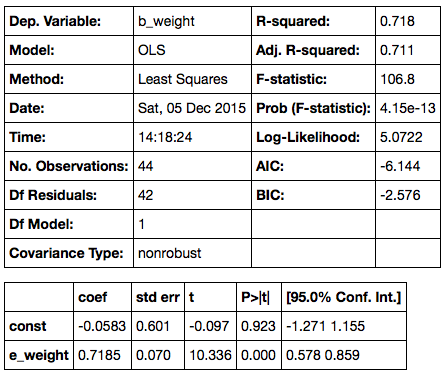
- The slope, its standard error, and the 95% confidence interval for the slope in the table above have all been estimated using formulas that are based on the regression model. This course does not cover all those formulas. Instead, the methods of the course allow you to estimate all of these quantities by using the familiar bootstrap method: bootstrap the scatter diagram repeatedly, compute the slope for each iteration of the bootstrap, and draw their histogram. The central 95% interval of this histogram forms your 95% confidence interval for the true slope; the center of the interval (alternatively, the mean of all the generated slopes), is your estimate of the true slope; the SD of all the generated slopes is your estimate for the standard error. Because the sample size is substantial, your bootstrap results will be close to those calculated using the relevant math formulas.
General Remarks about $t$-tests
- Typically, these are tests for population means and regression slopes. You can use the bootstrap instead. The bootstrap makes sense, it's easy to remember and execute, and it doesn't rely on lots of assumptions.
- Unless the sample size is really tiny, any $t$-curve being used is essentially the same as the standard normal curve. When you see a $t$ statistic, think $z$.
When sample sizes are small, the Central Limit Theorem doesn't apply, and assumptions really matter. Here are examples of assumptions under which $t$-tests are justified.
- $t$-test for a population mean: The distribution of the unknown population is normal, but we don't know its mean or its SD. It can be hard to check this assumption. You certainly can't justify it based on your small sample, and it is not always clear how it can be justified by other considerations.
- $t$-test for the difference between two population means: When two samples are being compared, there are two underlying unknown population SDs. These are often assumed to be equal because then the math works out nicely. But the assumptions can be a bit hard to swallow: we don't know the populations, but we assume that both are normal; we don't know the means or the SDs, but we assume that the two SDs are equal.
Calculations get complicated, for example if you don't make the assumption about equal SDs above. Here, from Wikipedia, is the calculation for the appropriate degrees of freedom in that case:
Formulas like this have a way of dampening the spirits, especially when there's little gain from all the pain: you just get a curve that is very close to the old familiar standard normal.
Conclusion
If you must use a $t$-test, please first provide an explanation of why you believe the assumptions underlying the method are justified for your data. This is a step that is forgotten all too often. We recommend simply using the bootstrap instead. There are no normality assumptions, no worries about whether SDs are equal, no messy formulas – and the results are just as good. All methods of inference have difficulties when samples are small. In that situation especially, it is better to work with a method like the bootstrap that makes very few assumptions.
Chance Models
Binomial and Multinomial Models
In the past few sections we have spent some time on inference in the setting of the classical regression model. But in fact we have used chance models all along. An important class of models appeared, albeit informally, when we studied the randomness in the selection of jury panels, back in Chapter 3. Let us examine those a little more carefully, to exactly how the chances come in.
For ease of reference, here is one of the examples from Chapter 3.
U.S. Supreme Court, 1965: Swain vs. Alabama
In the early 1960's, in Talladega County in Alabama, a black man called Robert Swain was convicted of raping a white woman and was sentenced to death. He appealed his sentence, citing among other factors the all-white jury. At the time, only men aged 21 or older were allowed to serve on juries in Talladega County. In the county, 26% of the eligible jurors were black, but there were only 8 black men among the 100 selected for the jury panel in Swain's trial. No black man was selected for the trial jury.
In 1965, the Supreme Court of the United States denied Swain's appeal. In its ruling, the Court wrote "... the overall percentage disparity has been small and reflects no studied attempt to include or exclude a specified number of Negroes."
Let us use the methods we have developed to examine the disparity between 8 out of 100 and 26 out of 100 black men in a panel drawn at random from among the eligible jurors.
AL_jury_rows = [
    ["Black",  0.26],
    ["Other", 0.74]
]
AL_jury = Table.from_rows(AL_jury_rows, ["Race", "Eligible"])
AL_jury
Null: Jury panel is like a random sample from the population of eligible jurors; that is, like the number of heads in 100 tosses of a coin that lands heads with chance 0.26.
Alternative: Jury panel is not like a random sample from the population of eligible jurors.
# Statistic: number black in sample of size 100
# Observed value of statistic: 8

# Compute the empirical distribution of the test statistic

sample_size = 100
repetitions = 500
eligible = AL_jury["Eligible"]

black_in_sample = Table([[]], ["Number black"])
for i in range(repetitions):
    sample = np.random.multinomial(sample_size, eligible)
    b = sample[0]
    black_in_sample.append([b])

black_in_sample.hist(bins = np.arange(-0.5, 100, 1), normed=True)
plots.ylim(0, 0.1)
plots.xlim(0,100)
plots.xlabel("number black in sample of 100 (under null)")
plots.title('Empirical Distribution')

As we noted in Chapter 3, the observed number of 8 black men on the jury panel is not consistent with the distribution above, computed under the null hypothesis. Therefore the data support the alternative: the panel was not selected at random.
Our goal here is to examine in detail the probability distribution of the number of black men on the panel, assuming random selection. Th empirical distribution above approximates that probability distribution. But can we say exactly what that distribution is?
We know that the probability distribution of the number of black men in a randomly selected group of 100 jurors can be found by forming all possible samples of 100 jurors, counting the number of black men in each of those samples, and looking at the histogram of that dataset. As there are a large number of possible samples, we have resorted to an empirical distribution based on some of them. However, it turns out that in this case there is a straightforward formula for the probabilities.
Binomial distribution with parameters $n=100$ and $p=0.26$
This is the name of the probability distribution of the number of 1's in a sample of size 100 drawn at random with replacement from a population consisting of 26% 1's and 74% 0's. It is also a good approximation if the sample is drawn without replacement from a population that is very large compared to the sample, as is the case in our example involving the jury panel.
In general, the binomial distribution is the probability distribution of the number of successes in a fixed, known number of repeated success/failure trials, where the result of any group of trials does not affect chances for the others. Examples are:
- the probability distribution of the number of sixes in repeated rolls of a die
- the probability distribution of the number of heads in repeated tosses of a coin (fair or unfair)
- the probability distribution of the number of voters who will vote for a particular candidate, assuming a random sample of voters that is essentially the same as a sample drawn at random with replacement
The assumption that no group of trials influences any others is called independence. Two events are independent if knowing that one of them has happened does not change chances for the other. For example, knowing that the first roll of a die resulted in the face with two spots does not change the chances for any face appearing on other rolls. We say that the rolls are independent of each other.
The binomial distribution has two parameters: the number of trials $n$, and the probability $p$ of success on each single trial. A parameter is a constant associated with a distribution. Here is a histogram of the distribution for $n = 100$ and $p = 0.26$. It is the exact distribution of probabilities for the number of black jurors in a panel of 100 jurors, drawn under the null hypothesis of random selection from an eligible population in which 26% are black. Notice that the distribution is a smooth version of its empirical approximation above.
probs = stats.binom.pmf(range(101), 100, .26)
k = np.arange(0,101,1)
dist = Table([k, probs], ['k', 'P(k black in 100)'])
dist.hist(counts='k', bins=np.arange(-0.5, 100.6, 1))
plots.xlim(0,100)
plots.ylim(0, 0.1)
plots.xlabel('number black in sample of 100 (under null)')
plots.title('Probability Distribution')

The c.d.f. of the binomial
We have seen the cumulative distribution function (c.d.f.) of the normal distribution evaluated at any point gives the proportion of area under the normal curve to the left of the point. So also the c.d.f. of the binomial distribution evaluated at a value gives the area of the bars of the histogram from 0 through the value.
The function is stats.binom.cdf. It takes as its arguments the value $k$, and the binomial parameters $n$ and $p$. It evaluates to the total probability of the bars $0, 1, 2, \ldots , k$.
Example 1.
To find the $P$-value of the test using the binomial distribution, we will start by finding the chance of 8 or fewer black men in the sample:
# Chance of "8 or fewer black in sample"
# = all the area in the bars 8 and below

stats.binom.cdf(8, 100, 0.26)
The chance is tiny, no matter whether you use a one-tailed test of a two-tailed test. This is consistent with there being no visible probability over the 0-8 range in the probability histogram above.
We can use the binomial distribution to find $P$-values in other contexts too.
Example 2.
In a blind taste test, 38 out of 64 people liked Drink A better than Drink B. A skeptic has an argument with the manufactuer of Drink A. Here are their positions.
Skeptic: That could have happened just by chance.
Manufacturer of Drink A: No way was that by chance.
State null and alternative hypotheses, and perform an appropriate test.
Formal null hypothesis: The test results are like the number of heads in 64 tosses of a fair coin.
Formal alternative hypothesis: The test results are not like heads in tosses of a coin.
If the null hypothesis were true, we would expect 32 "heads", that is, people who prefer Drink A. We got 38 heads. So to find the $P$-value, we will need to start with the chance of getting 38 or more heads in 64 tosses. We can calculate this using stats.norm.cdf after noting that the complement of "38 or more" is "37 or fewer".
# Chance of 38 or more heads in 64 tosses of a fair coin:

1 - stats.binom.cdf(37, 64, 0.5)
If the taste test had been based on tosses of a coin, there would be over an 8.4% chance of getting 38 or more "preferences" of Drink A. If you use the 5% cutoff, you would be justified in saying the data still support the null hypothesis, whether you use a one-tailed test or a two-tailed test.
Example 3.
Find the chance of exactly 50 heads in 100 tosses of a fair coin.
This is the chance of 0 through 50 heads minus the chance of 0 through 49 heads:
stats.binom.cdf(50, 100, 0.5) - stats.binom.cdf(49, 100, 0.5)
Notice that the chance is only about 8%. The chance of 500 heads in 1000 tosses is even smaller, just about 2.5%.
stats.binom.cdf(500, 1000, 0.5) - stats.binom.cdf(499, 1000, 0.5)
Notice that the chance of exactly half heads decreases as the number of tosses increases; indeed, it goes to zero. The law of averages says that the chance of about half heads increases. The word about is crucial; later in this section we will discuss how to quantify it.
The stats module contains a function that allows you to calculate the chance of exactly $k$ successes in a binomial model, without using stats.binom.cdf twice. The function is called stats.binom.pmf, for "probability mass function". Its arguments are the same as for stats.binom.cdf, but it evaluates to the probability of exactly $k$ successes.
# Probability mass function at k
# = chance of exactly k heads

stats.binom.pmf(50, 100, 0.5)
How does Python calculate the binomial probabilities? Let us see if we can figure out the answer. We will do so in a simpler context.
Example 4. In roulette, there are 18 chances in 38 to win a bet on "red". Suppose you bet on red on 5 different spins of the wheel. What is the chance that you win exactly 3 times?
The number of bets won has the binomial distribution with parameters $n=5$ and $p=18/38$. Here is a histogram of the distribution, and the chance of exactly 3 wins.
probs = stats.binom.pmf(range(6), 5, 18/38)
k = np.arange(0,6,1)
dist = Table([k, probs], ['k', 'P(k wins in 5 bets on red)'])
dist.hist(counts='k', bins=np.arange(-0.5, 5.6, 1))
plots.xlim(-1,6)
plots.xlabel('number of wins in 5 bets on red')
plots.title('Probability Distribution')

# chance of exactly 3 wins

stats.binom.pmf(3, 5, 18/38)
According to stats.binom.pmf, there is just under 30% chance that you win exactly 3 out of 5 bets on red. To see where this number comes from, let us try writing out some ways in which we could win 3 out of 5 bets.
- WLWLW
- WWWLL
- LWWWL
and so on.
Each way is a pattern consisting of 3 W's and 2 L's. Each of these patterns has chance $(18/38)^3 (20/38)^2$. The chance of winning exactly 3 times is the total chance of all these ways:
$$ P(\mbox{3 wins among 5 bets on red}) ~=~ \mbox{number of patterns of 3 W's and 2 L's} \cdot (18/38)^3 (20/38)^2 $$A fact of mathematics. The number of patterns consisting of 3 W's and 2 L's is called 5 choose 3 and is calculated as follows:
$$ \mbox{number of patterns of 3 W's and 2 L's} ~=~ {5 \choose 3} ~=~ \frac{5!}{3!2!} ~=~ 10 $$So
$$ P(\mbox{3 wins among 5 bets on red}) = 10 \cdot (18/38)^3(20/38)^2 $$This is calculated in the cell below, and agrees with the answer obtained earlier by using stats.binom.pmf.
10*((18/38)**3)*(20/38)**2
Binomial distribution with parameters $n$ and $p$
We can generalize our observations above to identify the probability distribution of the number of successes in $n$ repeated, independent, success/failure trials, with probability $p$ of success on each single trial. This is the binomial distribution with parameters $n$ and $p$.
$$ P(k \mbox{ successes in }n \mbox{ trials}) ~=~ {n \choose k} p^k (1-p)^{n-k} ~=~ \frac{n!}{k!(n-k)!} p^k (1-p)^{n-k} ~~~ \mbox{for} ~ 0 \le k \le n $$It is worth recalling that $0!$ is defined to be 1, so that the answers make sense in the two edge cases $k=0$ and $k=n$. Notice also that when we say "$k$ successes", we mean "exactly $k$ successes".
More than two categories: Multinomial Probabilities
The binomial can be generalized to the case where the population splits into more than two categories. This is called the multinomial model. That is why the NumPy method to simulate the draws is called np.random.multinomial.
Example 5. In a population, 20% of the people are men, 30% are women, and 50% are children. Six people are drawn at random with replacement. Find the chance that the sample contains 1 man, 2 women, and 3 children.
The answer is a straightforward generalization of the binomial formula above.
$$ P(\mbox{1 man, 2 women, 3 children}) ~=~ \frac{6!}{1!2!3!} (0.2)^1 (0.3)^2 (0.5)^3 $$Expected Value and Standard Error of the Binomial
In an earlier section, we saw that if we had $n$ independent, repeated, success/failure trials with probability $p$ of success on each trial, then:
$$ \mbox{expected proportion of successes} ~=~ p $$$$ \mbox{SE of the proportion of successes} ~=~ \sqrt{ \frac{p(1-p)}{n} } $$Now the number of success is just $n$ times the proportion of successes. Hence
$$ \mbox{expected number of successes} ~=~ np $$$$ \mbox{SE of the number of successes} ~=~ \sqrt{np(1-p)} $$Example 6. What is the expected value and standard error of the number of heads in 100 tosses of a coin?
According to the formulas above, the expected number of heads is $100 \times 0.5 = 50$ and the standard error is $\sqrt{100 \times 0.5 \times 0.5} = 5$. That the expected value should be 50 is easy to guess. To visualize the standard error, it helps to see the histogram of the binomial distribution with $n=100$ and $p=0.5$.
probs = stats.binom.pmf(np.arange(30, 71, 1), 100, 1/2)
k = np.arange(30,71,1)
dist = Table([k, probs], ['k', 'P(k heads in 100 tosses)'])
dist.hist(counts='k', bins=np.arange(29.5, 70.6, 1))
plots.xlim(25,75)
plots.xlabel('number of heads in 100 tosses')
plots.title('Probability Distribution')

Notice the beautifully symmetric, normal shape, centered at 50. The points of inflection of the curve are at 45 and 55, one standard error away from the expected value. That is consistent with the points "mean $\pm$ SD" being the points of inflecion of a normal curve.
Notice also that the number of heads is most likely to be in the 35-65 range, that is, within 3 standard errors of the expected value. Even though the possible values are 0 through 100, the probable values are in a much smaller range.
Example 7. What is the chance that the proportion of heads will be between 0.45 and 0.55, if you toss a coin
(a) 100 times?
(b) 1000 times?
We can answer both of these questions by using stats.binom.cdf. We do have to be consistent in our definition of "between". We will take it to mean "between 0.45 and 0.55, inclusive". That is, we will include both the endpoints in the interval.
#(a) 100 tosses; chance that the proportion of heads is between 0.45 and 0.55

stats.binom.cdf(55, 100, 0.5) - stats.binom.cdf(44, 100, 0.5)
#(a) 1000 tosses; chance that the proportion of heads is between 0.45 and 0.55

stats.binom.cdf(550, 1000, 0.5) - stats.binom.cdf(449, 1000, 0.5)
Notice how the chance rose from about 73% to well over 99%. That's because of the law of averages. The chance that the proportion of heads is in any fixed interval around 0.5 goes up as the number of tosses increases.
We could also have given rough approximations to these answers by using the normal approximation. In both cases, the proportion of heads is expected to be 0.5.
- When there are 100 tosses, the standard error of the proportion is $\sqrt{0.5 \times 0.5 /100} = 0.05$.
- When there are 1000 tosses, the standard error of the proportion is $\sqrt{0.5 \times 0.5 /1000} = 0.0158$.
The corresponding normal curves give the following approximations. You can see that the approximation is better when the number of tosses is larger. Because the normal curve is continuous, we need not worry about including or excluding endpoints; each single point corresponds to an area of 0.
# Normal approximation to the chance of between 0.45 and 0.55 heads in 100 tosses

stats.norm.cdf(0.55, 0.5, 0.05) - stats.norm.cdf(0.45, 0.5, 0.05)
# Normal approximation to the chance of between 0.45 and 0.55 heads in 1000 tosses

stats.norm.cdf(0.55, 0.5, 0.0158) - stats.norm.cdf(0.45, 0.5, 0.0158)
Conditional Dependence
In many situations involving multiple events, knowing whether some of them have happened affects chances for the others. For example, if we are dealing two cards at random without replacement from a standard deck, then knowing that the first card dealt is the ace of spades would tell us that it is impossible for the second card to be the ace of spades. Such events are called dependent.
We will conclude the course with an introduction to chance models that involve two dependent features. To start off, we will examine the main questions in the context of an example where the answers are easily understood.
Example 1.
An undergraduate class consists of sophomores and juniors. Many of the students have declared their majors, but some have not. Here is the distribution of categories in the class:
- 40% of the students are sophomores and the rest are juniors
- Among the sophomores, 50% have declared their majors
- Among the juniors, 80% have declared their majors
We have seen in an earlier section that data like this can be summarized in a tree diagram that partitions the class into four distinct categories of students:
- Sophomore, undeclared
- Sophomore, declared
- Junior, undeclared
- Junior, declared
Here is a very simple chance model.
Suppose that one student is picked at random.
The dependent features are the student's year and major status: if we know that the student is a sophomore, the chance that the student has declared a major is 0.5, whereas if we know that the student is a junior, the chance that the student has declared is 0.8.
a) Find the chance that the student is undeclared.
Since the model is that the student is picked at random, the answer is just the proportion of undeclared students in the class. Half of the sophomores are undeclared, as are 20 percent of the juniors. Hence the answer is $0.4 \times 0.5 ~+~ 0.6 \times 0.2 ~=~ 0.32$.
Notice that to find this chance, we added up the chances of the two relevant branches of the tree; to find the chance of a single branch, we multiplied the chances along the branch.
b) Find the chance that the student is undeclared, given that the student is a sophomore.
This question asks for the proportion of undeclared students just among the sophomores. That proportion is known to be 0.5.
c) Find the chance that the student is a sophomore.
Again, this can be read off the tree diagram. The chance is 0.4.
d) Find the chance that the student is sophomore, given that the student is undeclared.
This question asks for a "backwards" conditional probability; conditioning in the opposite direction to the information provided. The solution uses a method called Bayes' Rule, named for its originator, the Reverend Thomas Bayes, an Englishman who lived in the early 18th century. The method simply works out proportion of sophomores among the undeclared students. That is the proportion in the top Undeclared branch, relative to the total proportion in the two Undeclared branches. $$ \frac{0.4 \times 0.5}{0.4 \times 0.5 ~+~ 0.6 \times 0.2} ~=~ 0.625 $$
This is computed in the cell below.
# d) chance that student is sophomore, given that student is undeclared
# Method: Bayes' Rule for "backwards in time" conditional probabilities

(0.4*0.5)/(0.4*0.5 + 0.6*0.2)
Notice that when we only knew that the student was a randomly picked member of the class, we said that there was a 40% chance that the student was a sophomore. But given that the student is undeclared, our answer goes up to 62.5%. This is a result of the dependence between the student's year and major declaration status: undeclared students are more likely to be sophomores than juniors.
We will now use Bayes' Rule to answer a more interesting question.
Example 2. In a population, there is a rare disease. Researchers have developed a medical test for the disease. Mostly, the test correctly identifies whether or not the tested person has the disease. But sometimes, the test is wrong. Here are the relevant proportions.
- 1% of the population has the disease
- If a person has the disease, the test returns the correct result with chance 99%.
- If a person does not have the disease, the test returns the correct result with chance 99.5%.
One person is picked at random from the population. Given that the person tests positive, what is the chance that the person has the disease?
We begin by partitioning the population into four categories in the tree diagram below.
By Bayes' Rule, the chance that the person has the disease given that he or she has tested positive is the chance of the top "Test Positive" branch relative to the total chance of the two "Test Positive" branches. The answer is $$ \frac{0.01 \times 0.99}{0.01 \times 0.99 ~+~ 0.99 \times 0.005} ~=~ 0.667 $$
# The person is picked at random from the population.

# By Bayes' Rule:
# Chance that the person has the disease, given that test was +

(0.01*0.99)/(0.01*0.99 + 0.99*0.005)
This is 2/3, and it seems rather small. The test has very high accuracy, 99% or higher. Yet is our answer saying that if a patient gets tested and the test result is positive, there is only a 2/3 chance that he or she has the disease?
To understand our answer, it is important to recall the chance model: our calculation is valid for a person picked at random from the population. Among all the people in the population, the people who test positive split into two groups: those who have the disease and test positive, and those who don't have the disease and test positive. The latter group is called the group of false positives. The proportion of true positives is twice as high as that of the false positives – $0.01 \times 0.99$ compared to $0.99 \times 0.005$ – and hence the chance of a true positive given a positive test result is $2/3$. The chance is affected both by the accuracy of the test and also by the probability that the sampled person has the disease.
But a patient who goes to get tested for a disease is not well modeled as a random member of the population. People get tested because they think they might have the disease, or because their doctor thinks so. In such a case, saying that their chance of having the disease is 1% is not justified; they are not picked at random from the population.
So, while our answer is correct for a random member of the population, it does not answer the question for a person who has walked into a doctor's office to be tested.
To answer the question for such a person, we must first ask ourselves what is the probability that the person has the disease. It is natural to think that it is larger than 1%, as the person has some reason to believe that he or she might have the disease. But how much larger?
This cannot be decided based on relative frequencies. The probability that a particular individual has the disease has to be based on a subjective opinion, and is therefore called a subjective probability. Some researchers insist that all probabilities must be relative frequencies, but subjective probabilities abound. The chance that a candidate wins the next election, the chance that a big earthquake will hit the Bay Area in the next decade, the chance that a particular country wins the next soccer World Cup: none of these are based on relative frequencies or long run frequencies. Each one contains a subjective element.
It is fine to work with subjective probabilities as long as you keep in mind that there will be a subjective element in your answer. Be aware also that different people can have different subjective probabilities of the same event. For example, the patient's subjective probability that he or she has the disease could be quite different from the doctor's subjective probability of the same event. Here we will work from the patient's point of view.
Suppose the patient assigned a number to his/her degree of uncertainty about whether he/she had the disease, before seeing the test result. This number is the patient's subjective prior probability of having the disease.
If that probability were 10%, then the probabilities on the left side of the tree diagram would change accordingly, with the 0.1 and 0.9 now interpreted as subjective probabilities:
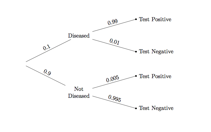
The change has a noticeable effect on the answer, as you can see by running the cell below.
# Subjective prior probability of 10% that the person has the disease

# By Bayes' Rule:
# Chance that the person has the disease, given that test was +

(0.1*0.99)/(0.1*0.99 + 0.9*0.005)
If the patient's prior probability of having the disease is 10%, then after a positive test result the patient must update that probability to over 95%. This updated probability is called a posterior probability. It is calculated after learning the test result.
If the patient's prior probability of havng the disease is 50%, then the result changes yet again.
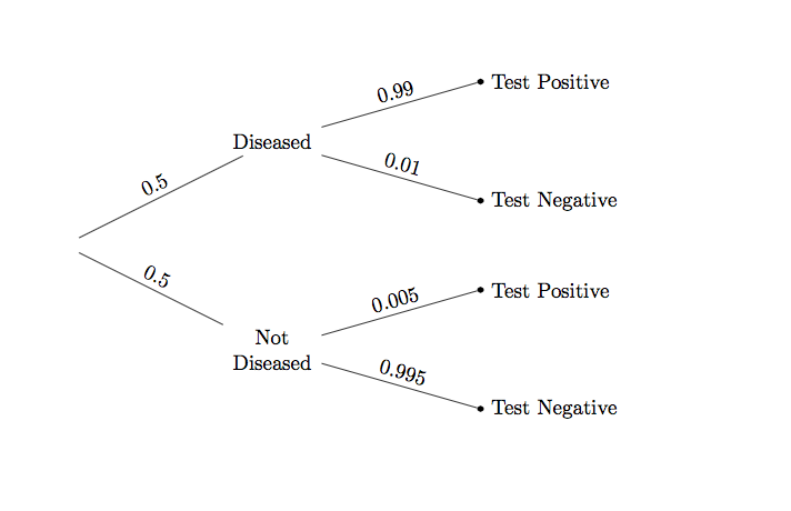
# Subjective prior probability of 50% that the person has the disease

# By Bayes' Rule:
# Chance that the person has the disease, given that test was +

(0.5*0.99)/(0.5*0.99 + 0.5*0.005)
Starting out with a 50-50 subjective chance of having the disease, the patient must update that chance to about 99.5% after getting a positive test result.
Computational Note. In the calculation above, the factor of 0.5 is common to all the terms and cancels out. Hence arithmetically it is the same as a calculation where the prior probabilities are apparently missing:
0.99/(0.99 + 0.005)
But in fact, they are not missing. They have just canceled out. When the prior probabilities are not all equal, then they are all visible in the calculation as we have seen earlier.
In machine learning applications such as spam detection, Bayes' Rule is used to update probabilities of messages being spam, based on new messages being labeled Spam or Not Spam. You will need more advanced mathematics to carry out all the calculations. But the fundamental method is the same as what you have seen in this section.